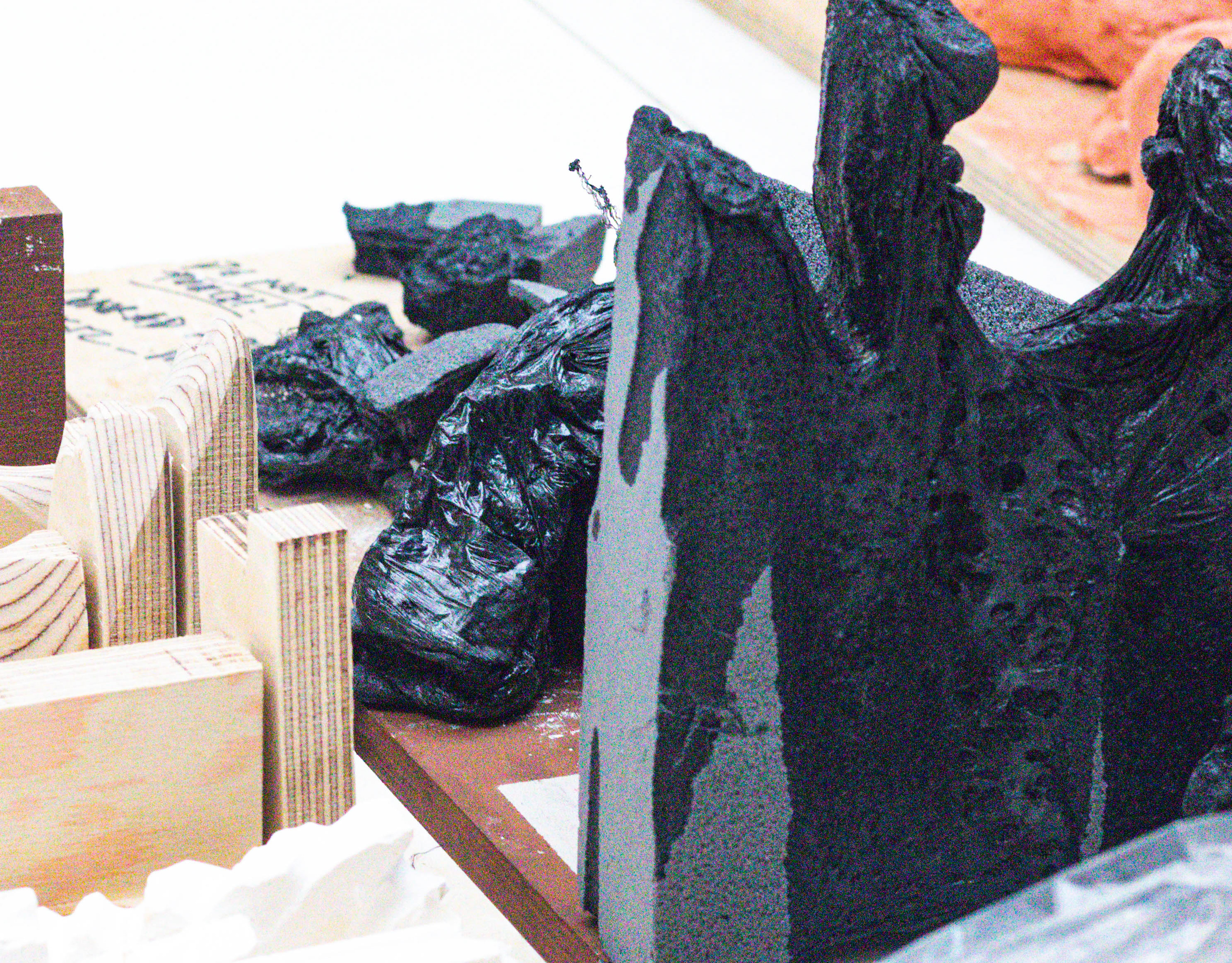
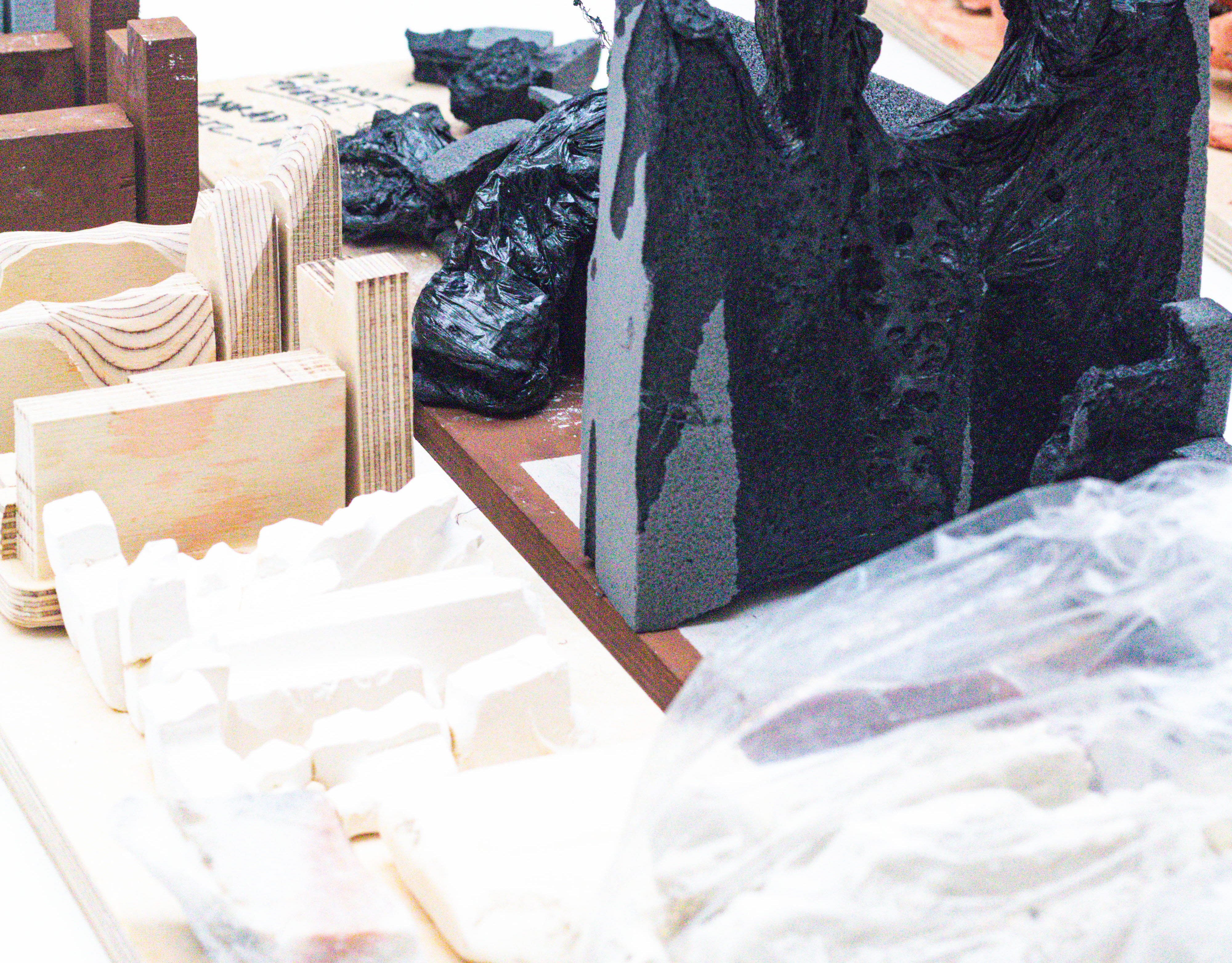
During this study trip, we explored Porto and a few surrounding towns, tracing the architectural stories of works by Álvaro Siza, Rem Koolhaas & Eduardo Souto de Moura. This journal entry will explore those key sites and what each one added to the architectural grain of the region's story.
Porto Riverfront- Day 01.
Porto In Context
Overview.
Porto, Portugal.
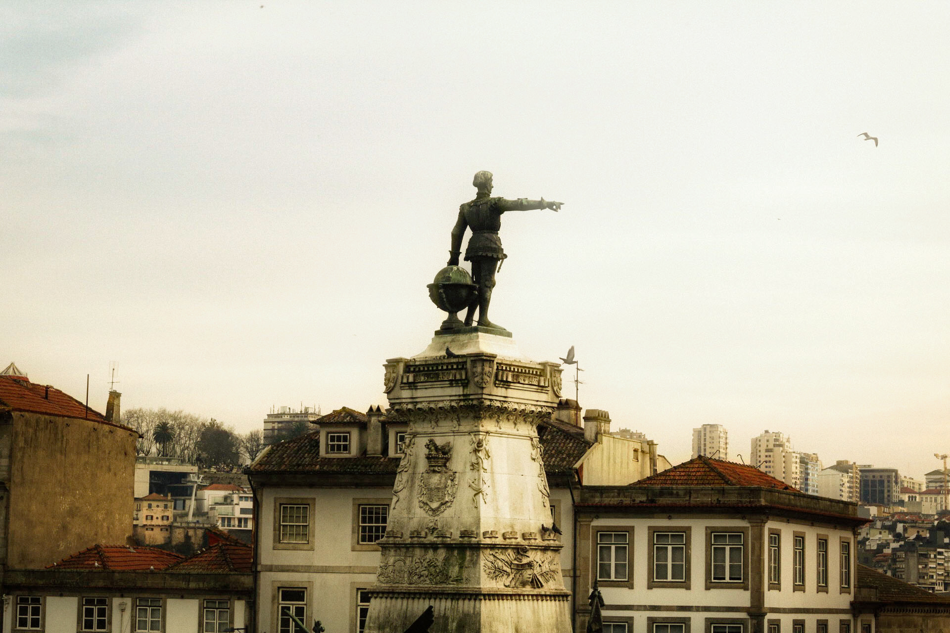
The city points somewhere.
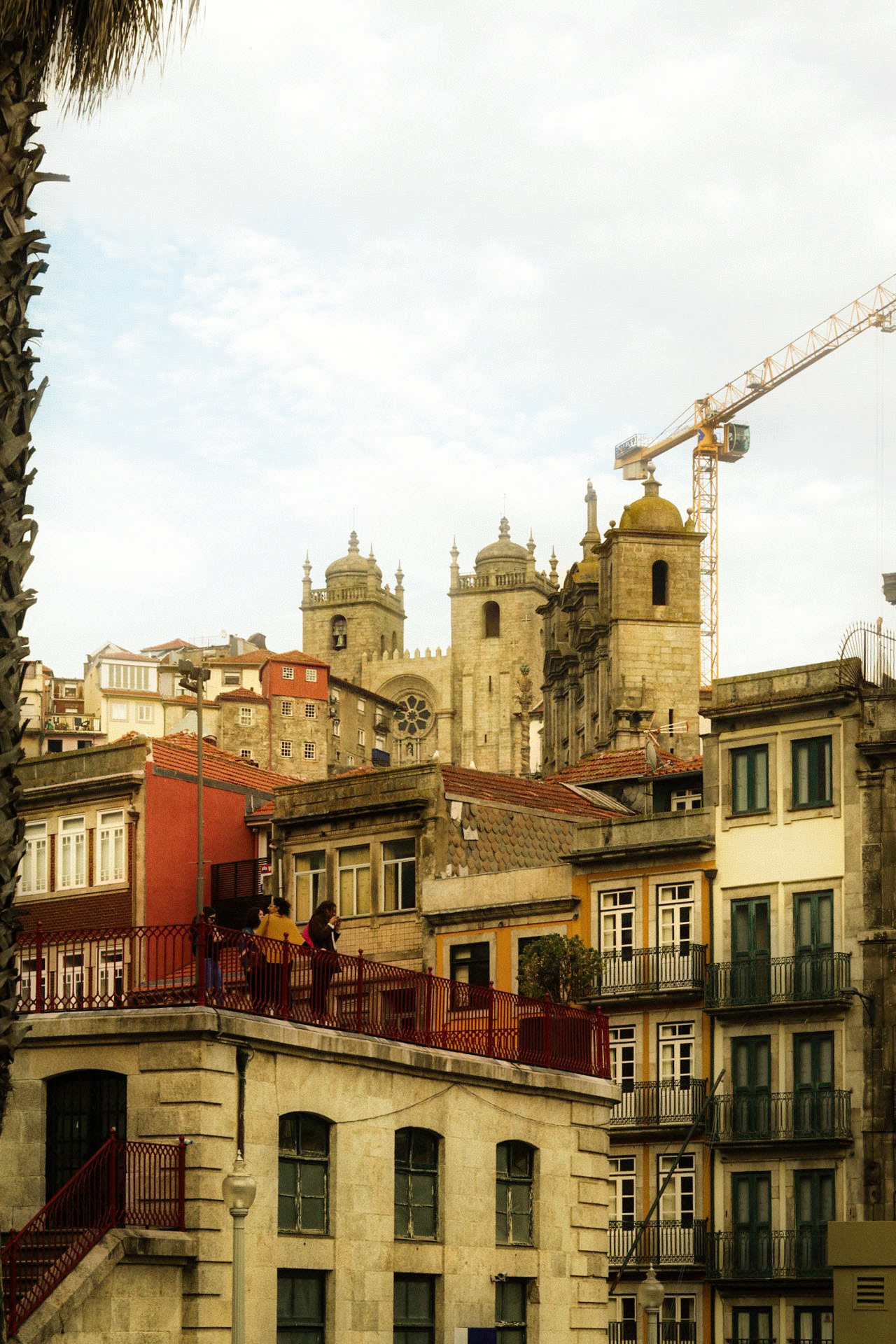
Age and Change

Porto Skyline
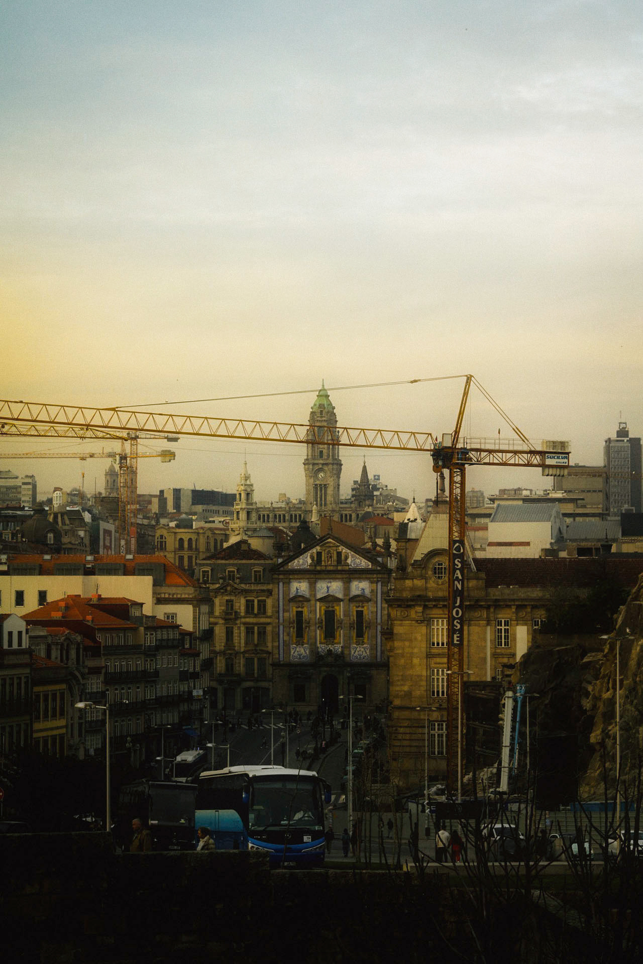
Construction in Historia
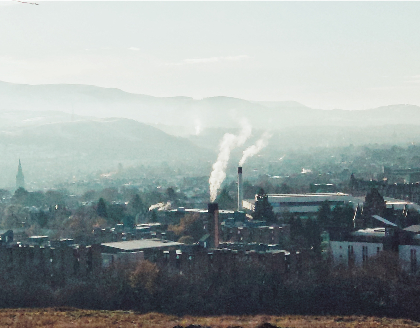
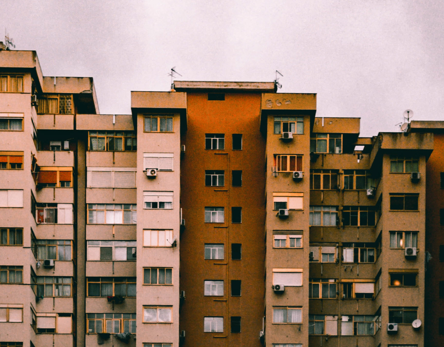
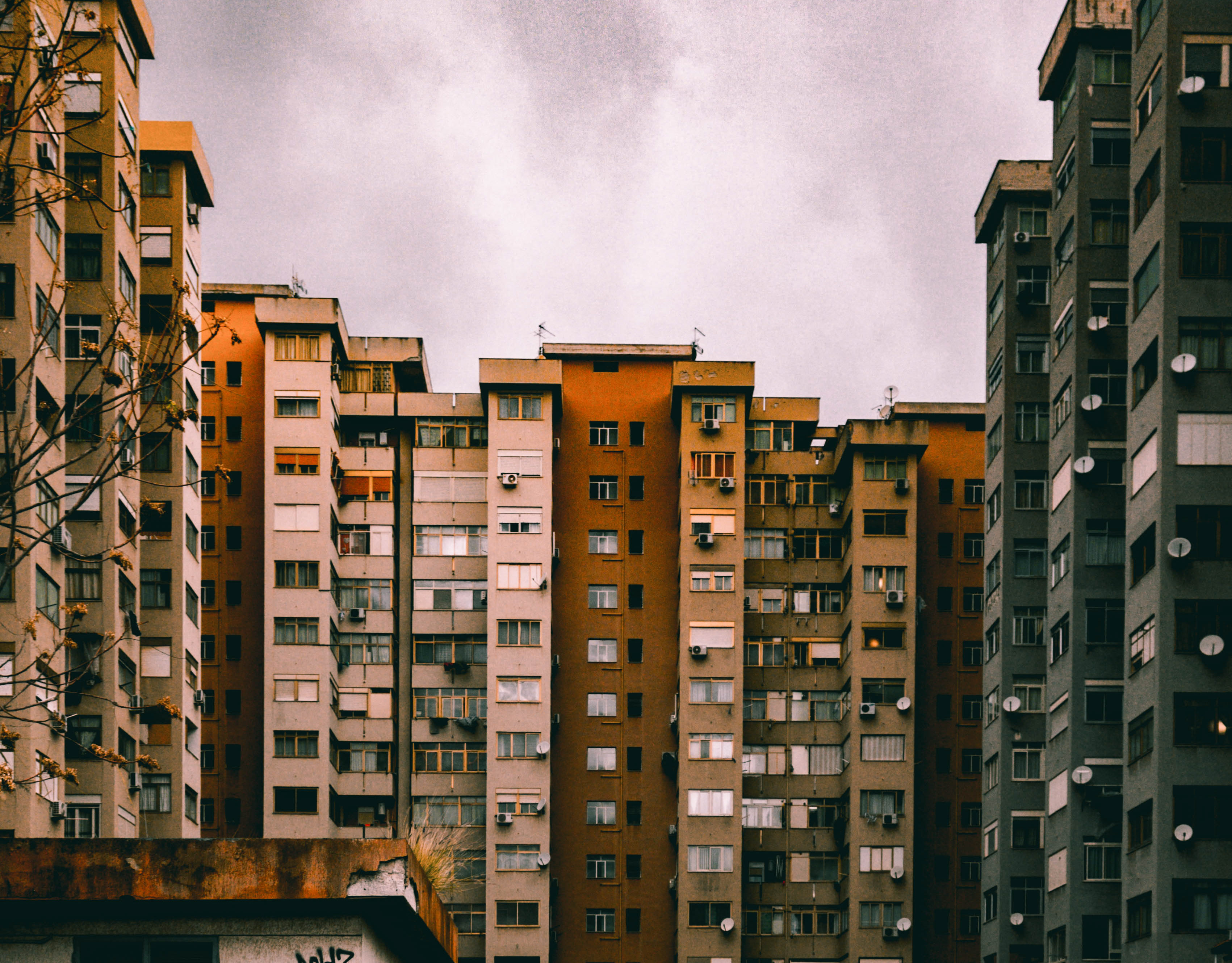
Our study trip began at Porto, my initial investigations of the city's urban grain is that it was a city very much focused on its history, through the very traditional European Architecture and the use of traditional Portuguese tiles for cladding solutions.
Braga Stadium
Eduardo Souto de Moura.
Enter Braga- Day 02.
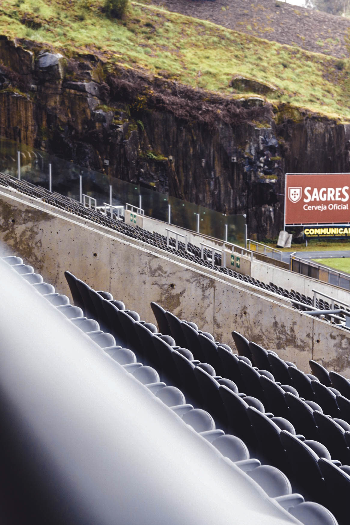
Stadium Seating
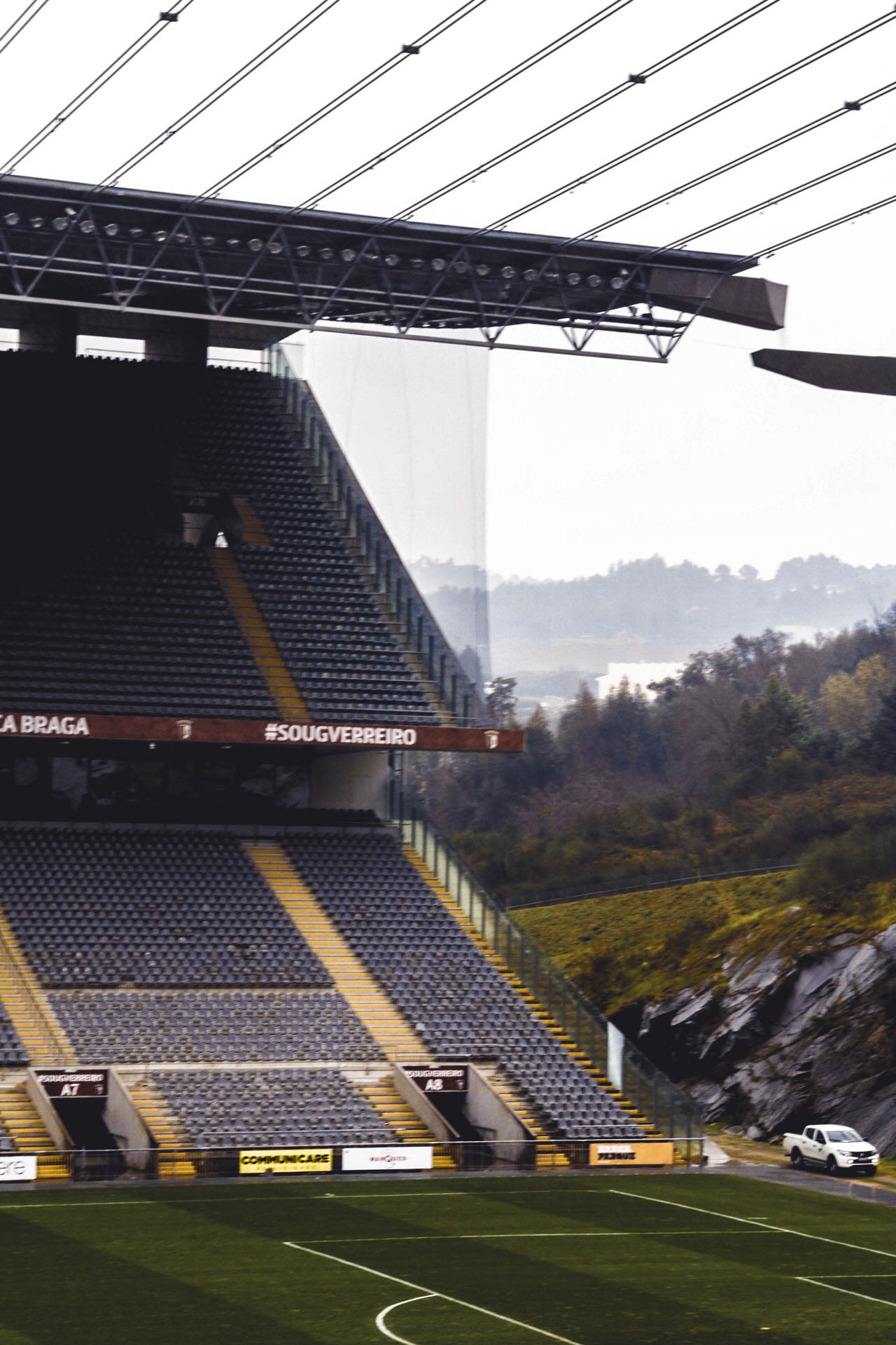
Stadium.
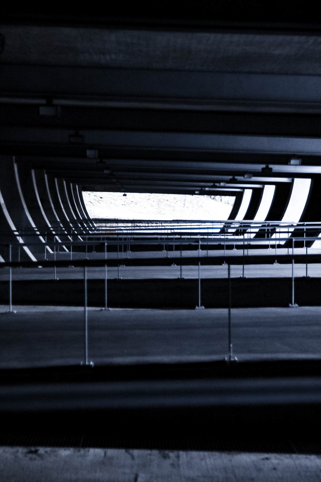
Repetition.
Colossus in Concrete.
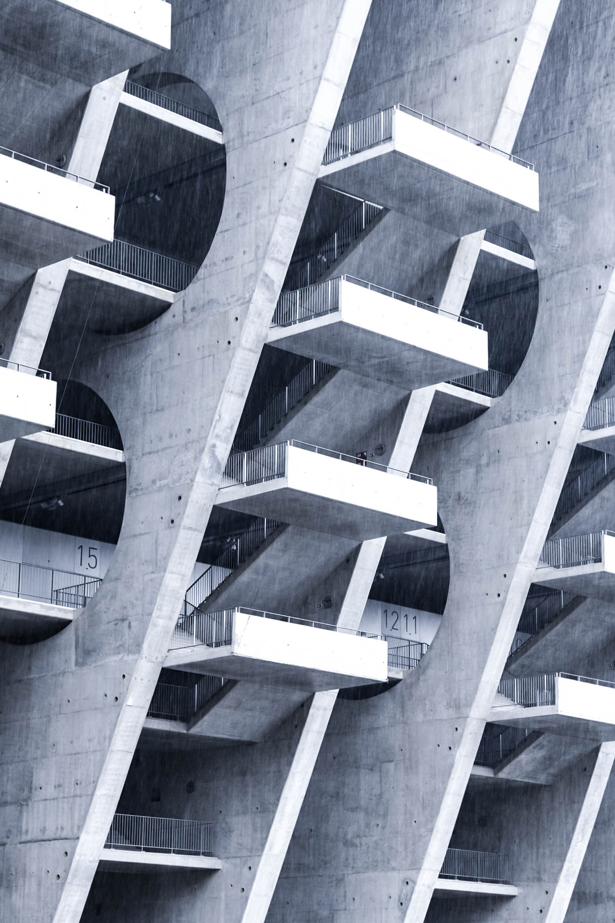
Day 2, our we explored a little further out of Porto into Braga and Matosinhos. Looking first at Braga, we explored the football stadium designed by Eduardo Souto de Moura. It's structure a dominant and imposing concrete structure with strong gestural shapes created through space and void, only further emphasized by the use of repetition.
Boa Nova Teahouse
Álvaro Siza.
Approaching Boa Nova.
Minimalism.
Shape, Void, Light.
Entrance.
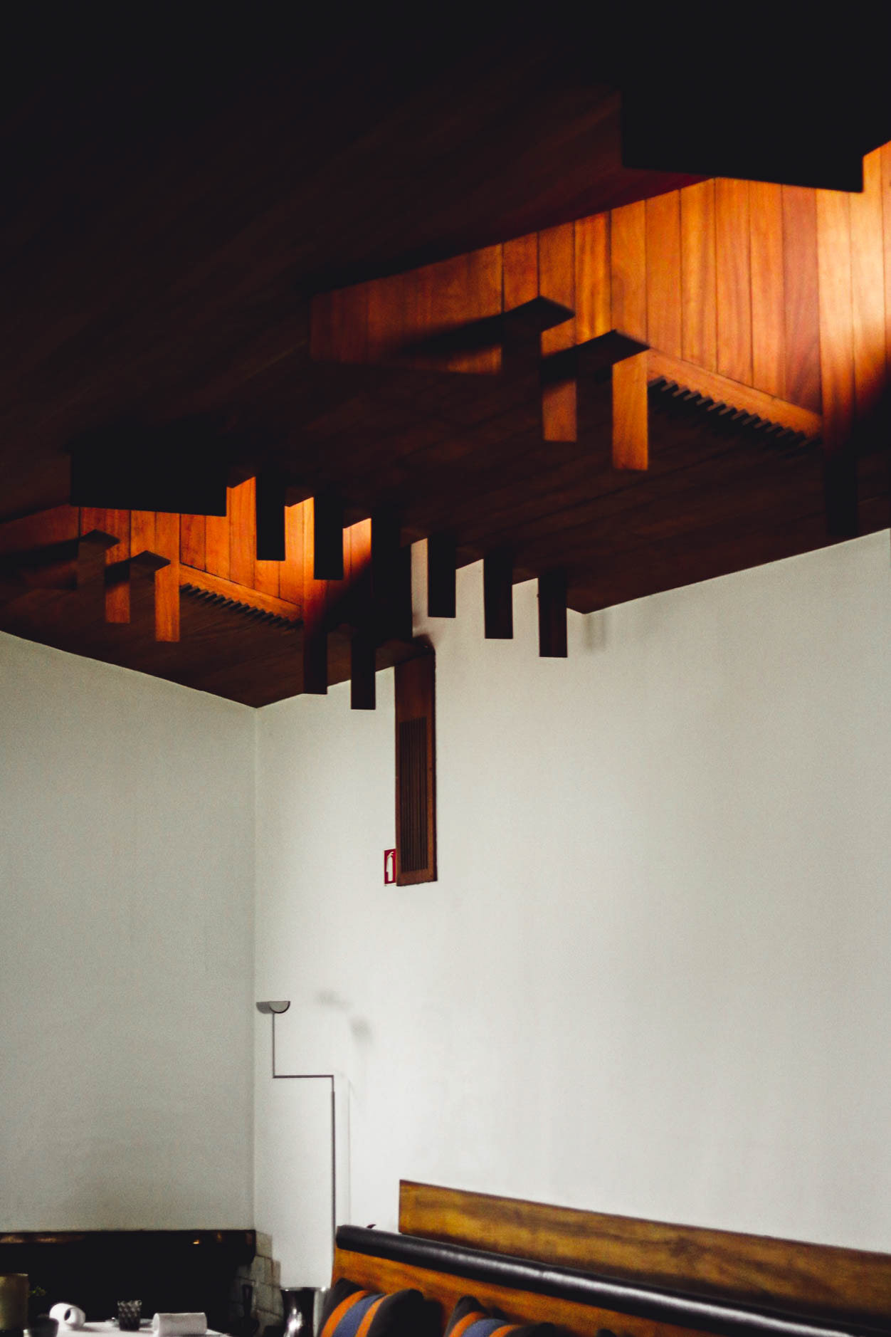
Material and Light.
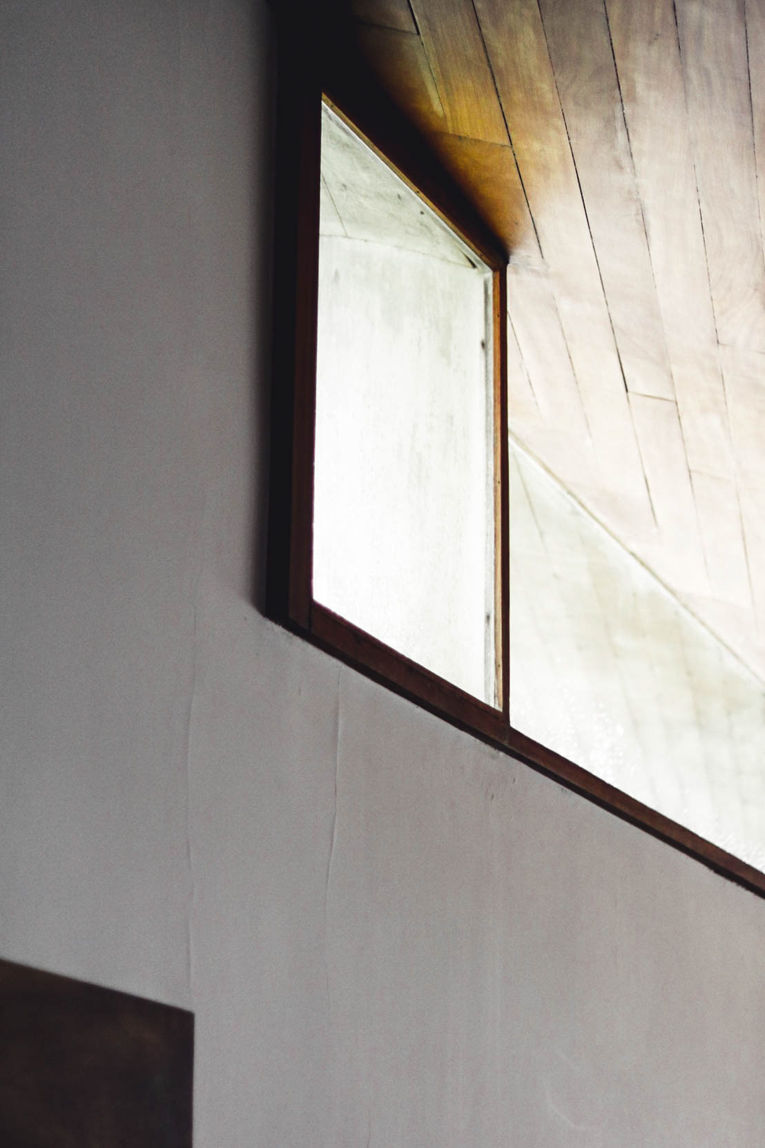
Shape Gestures.
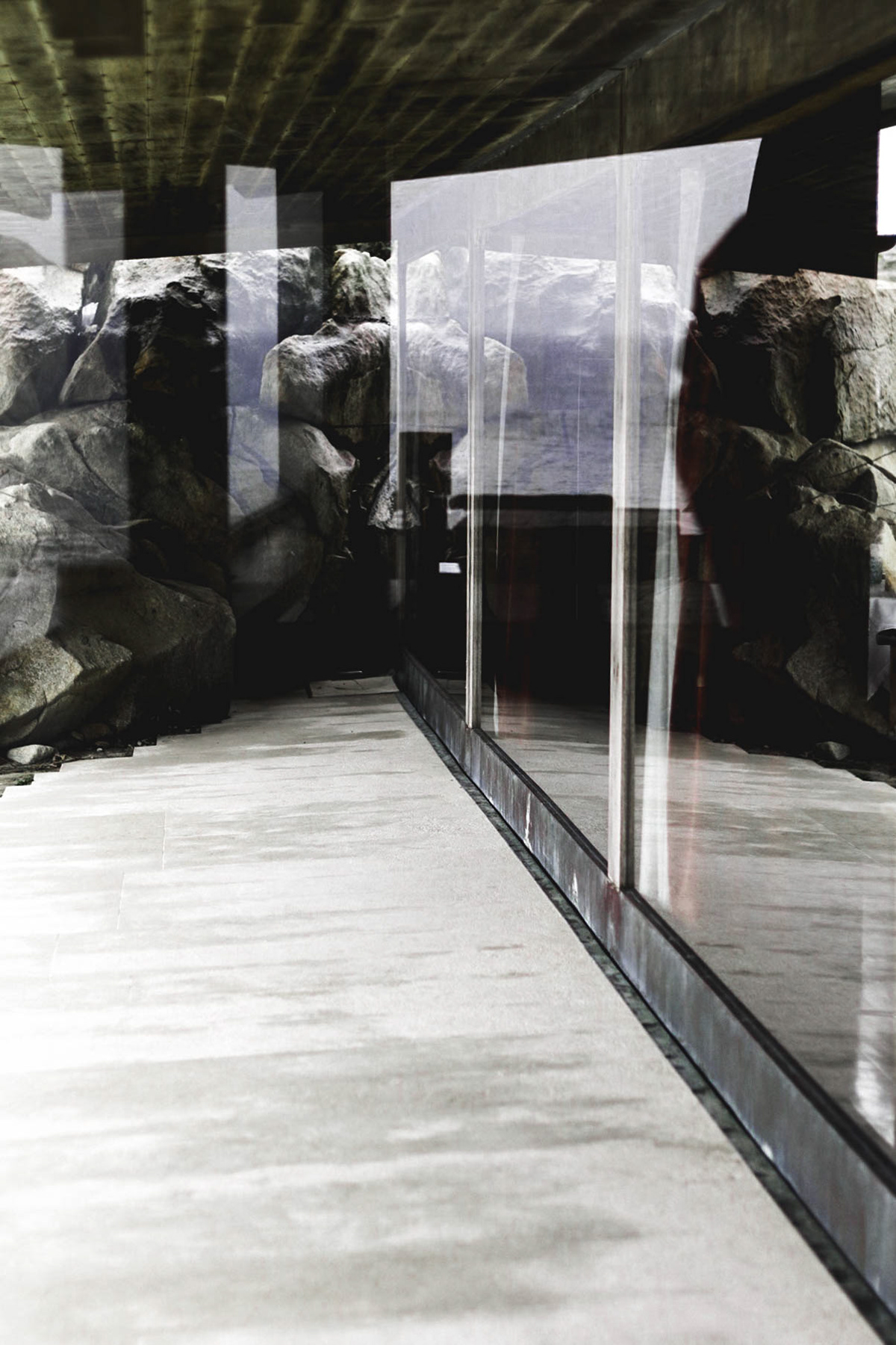
Boa Nova and the Rockface.
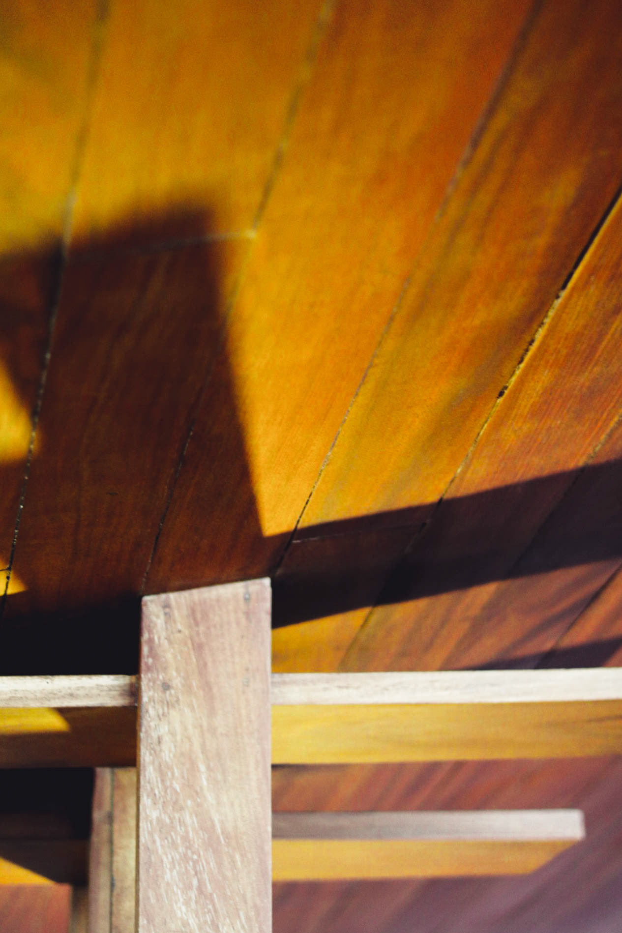
Timber Junctions.

Staircase Detail.
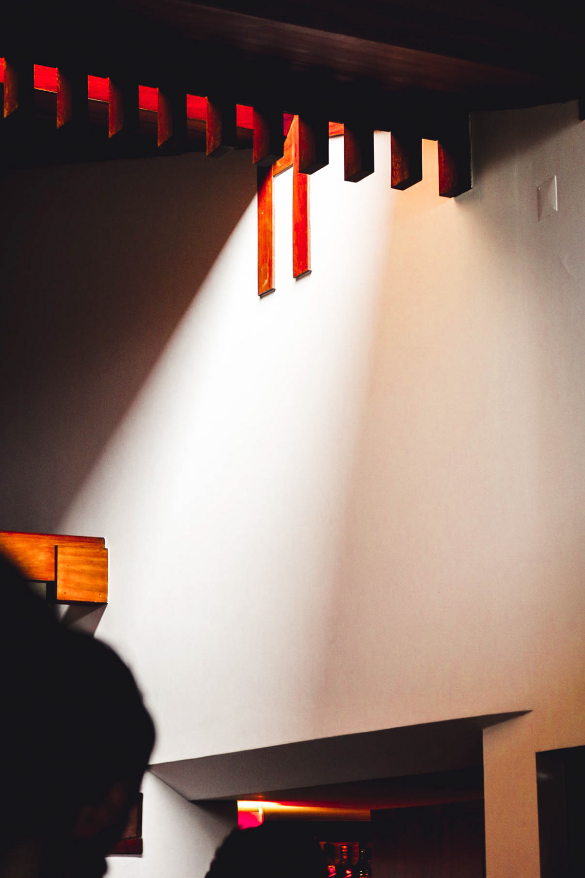
Lightwell.
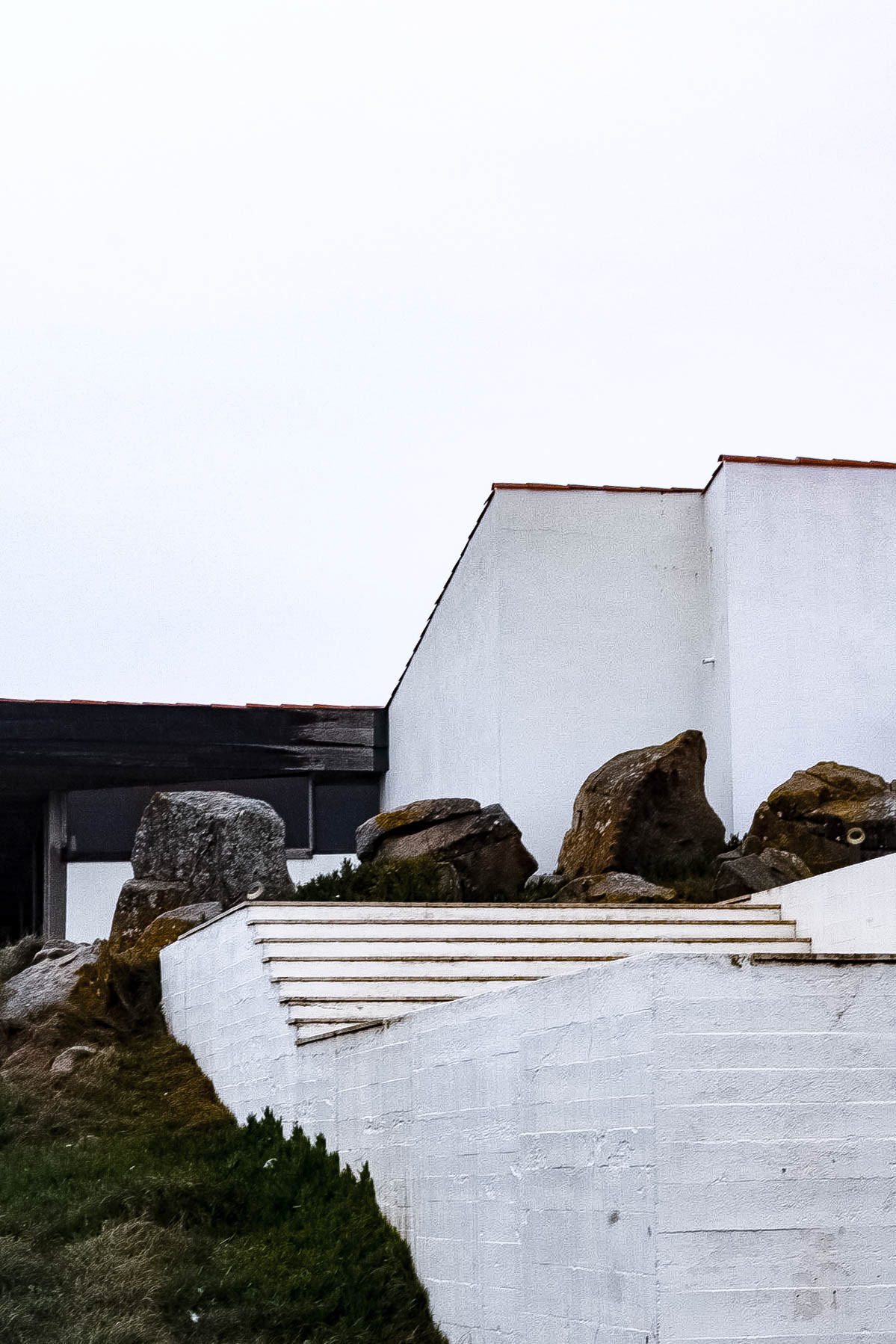
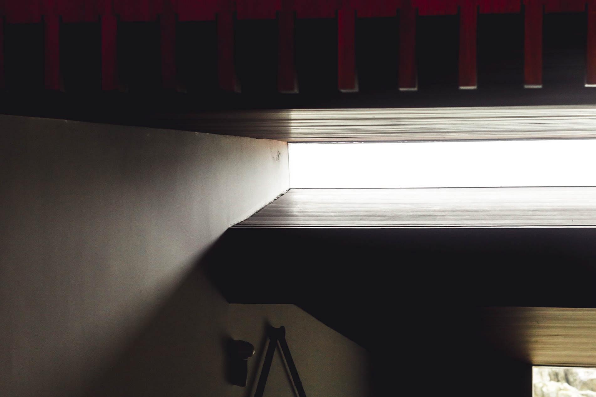
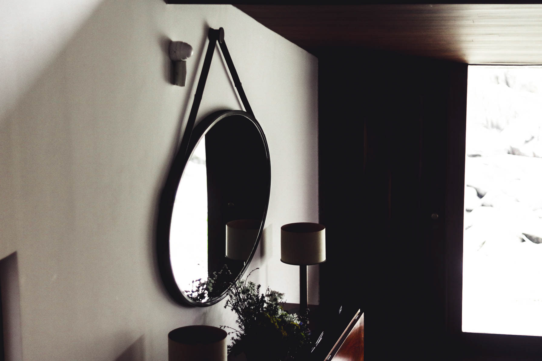
One of my favourite buildings from the study trip, the combination of site, form, detail and use of light and shadow in the building created a series of elegantly beautiful moments that guide you through the space and onto the views of the sea and cliffside beyond.
Casa da Música
Rem Koolhaas.
Casa de Música - The Meteor of Porto.

Curtain Wall.
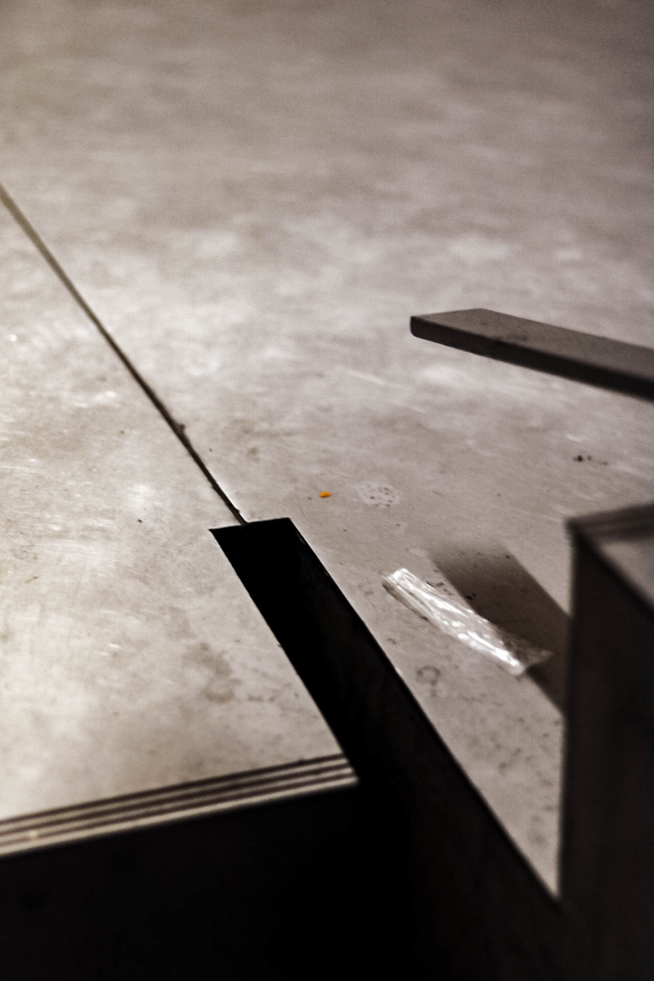
Stair Detail.
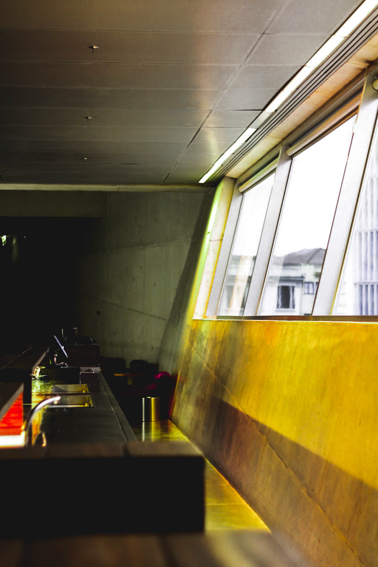
Angular.
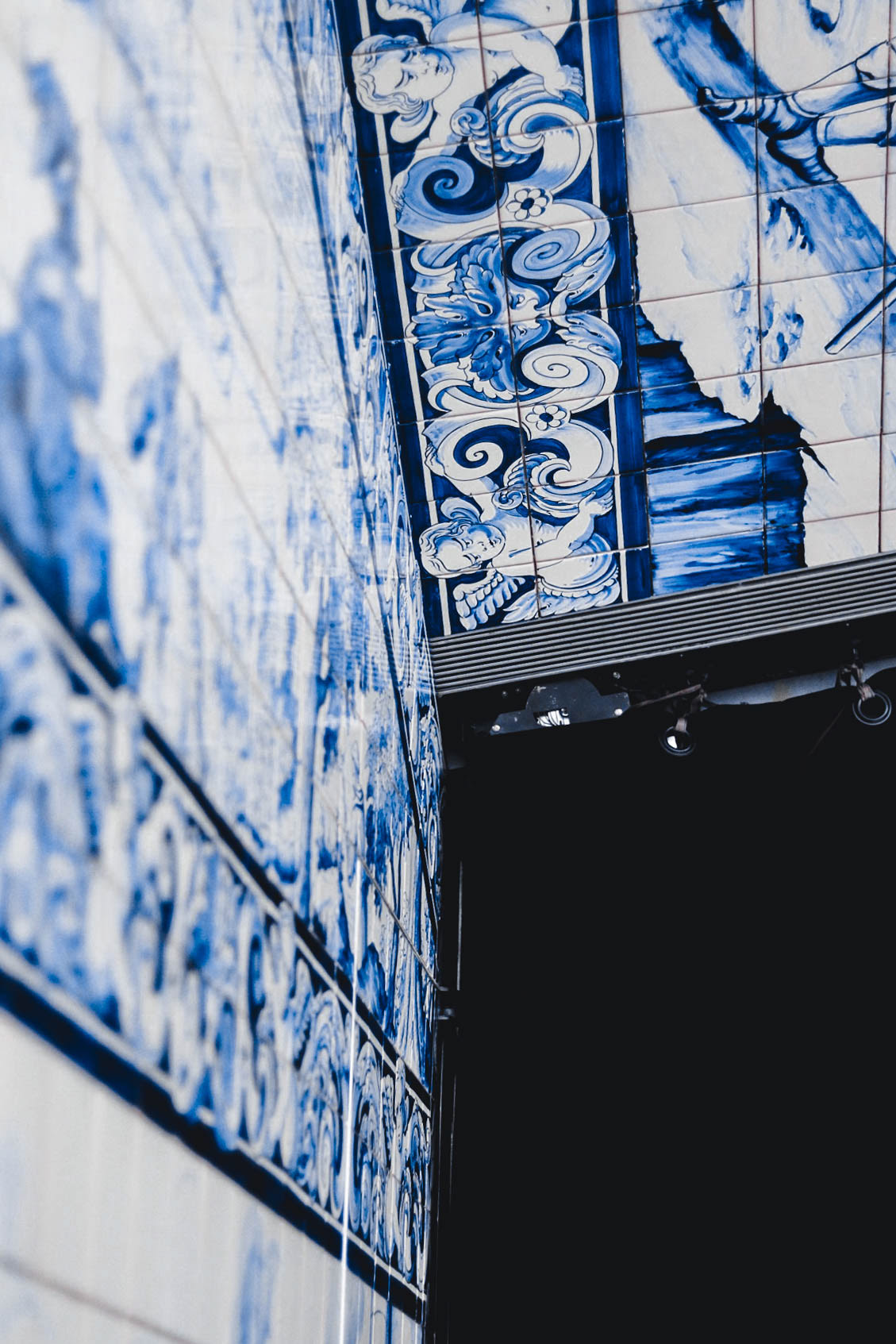
Tradtional Tile meets Contemporary Form.
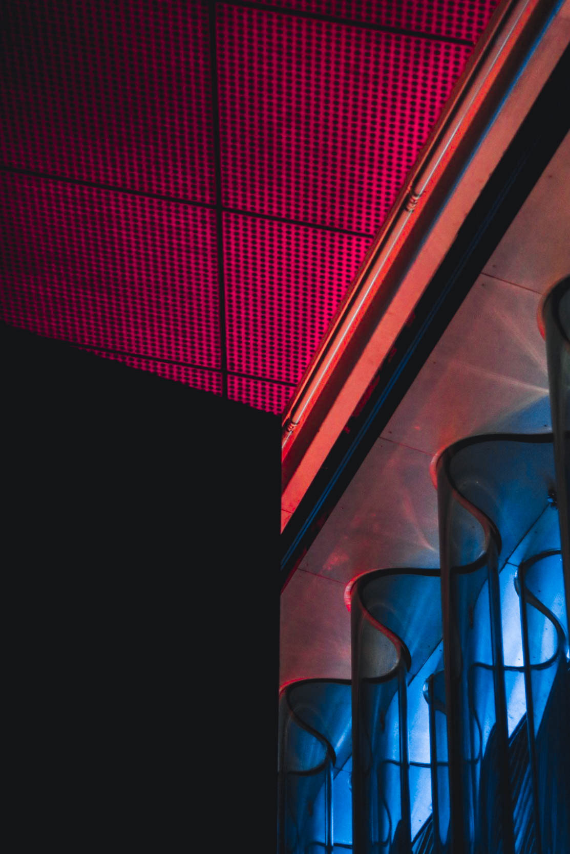
Colour Junction.
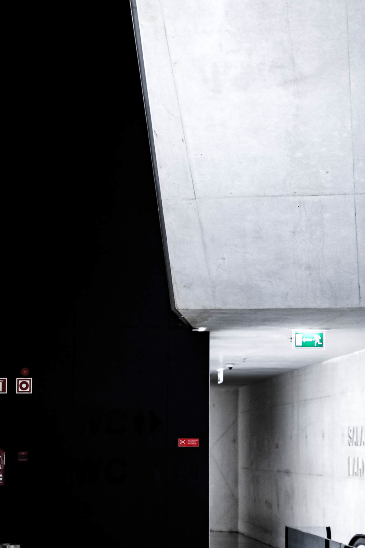
High Contrast.
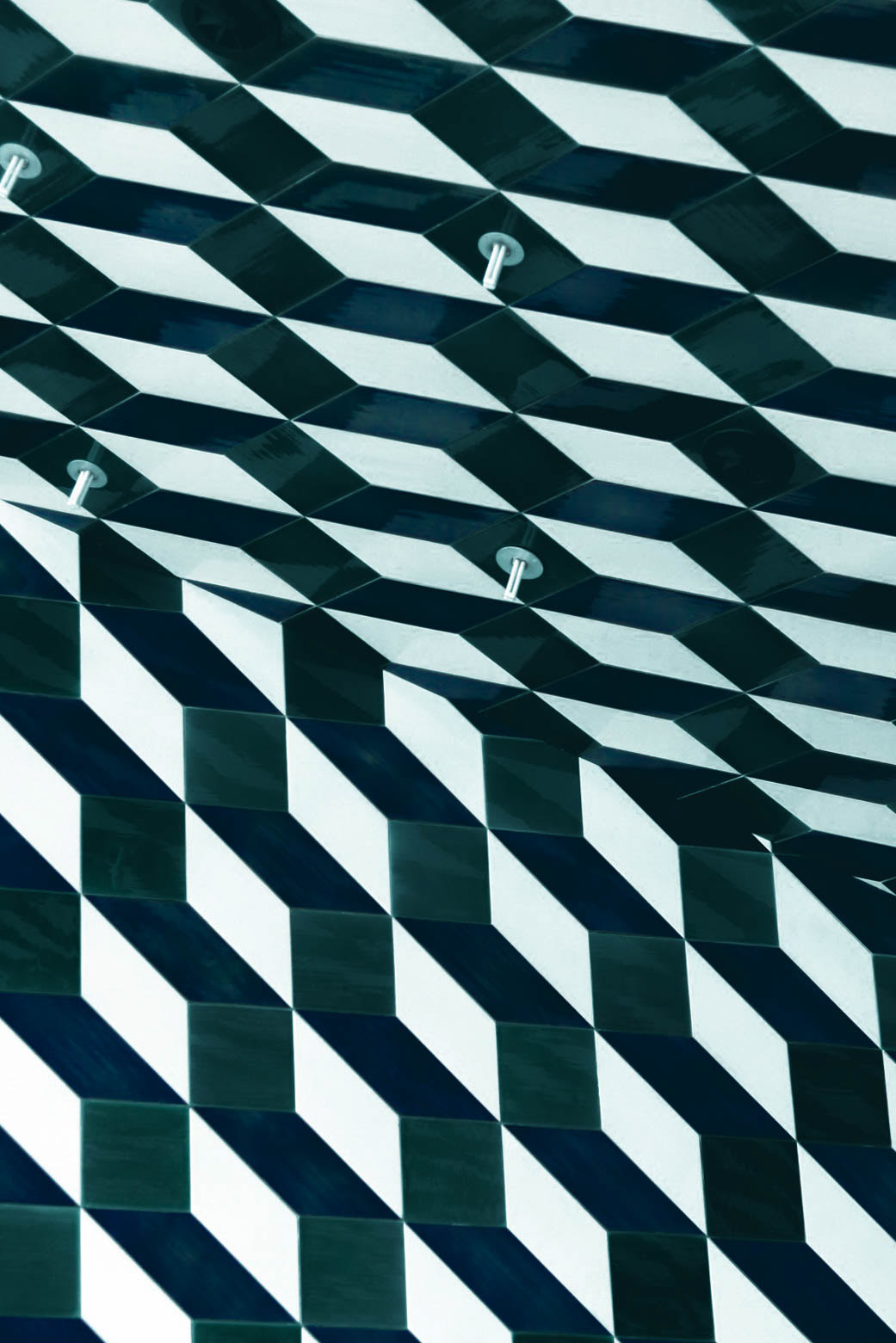
Pattern.
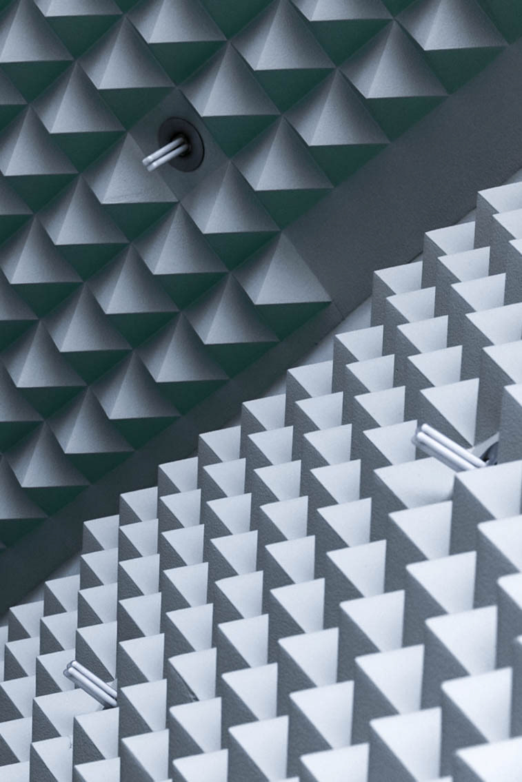
Acoustic & Sculpture.
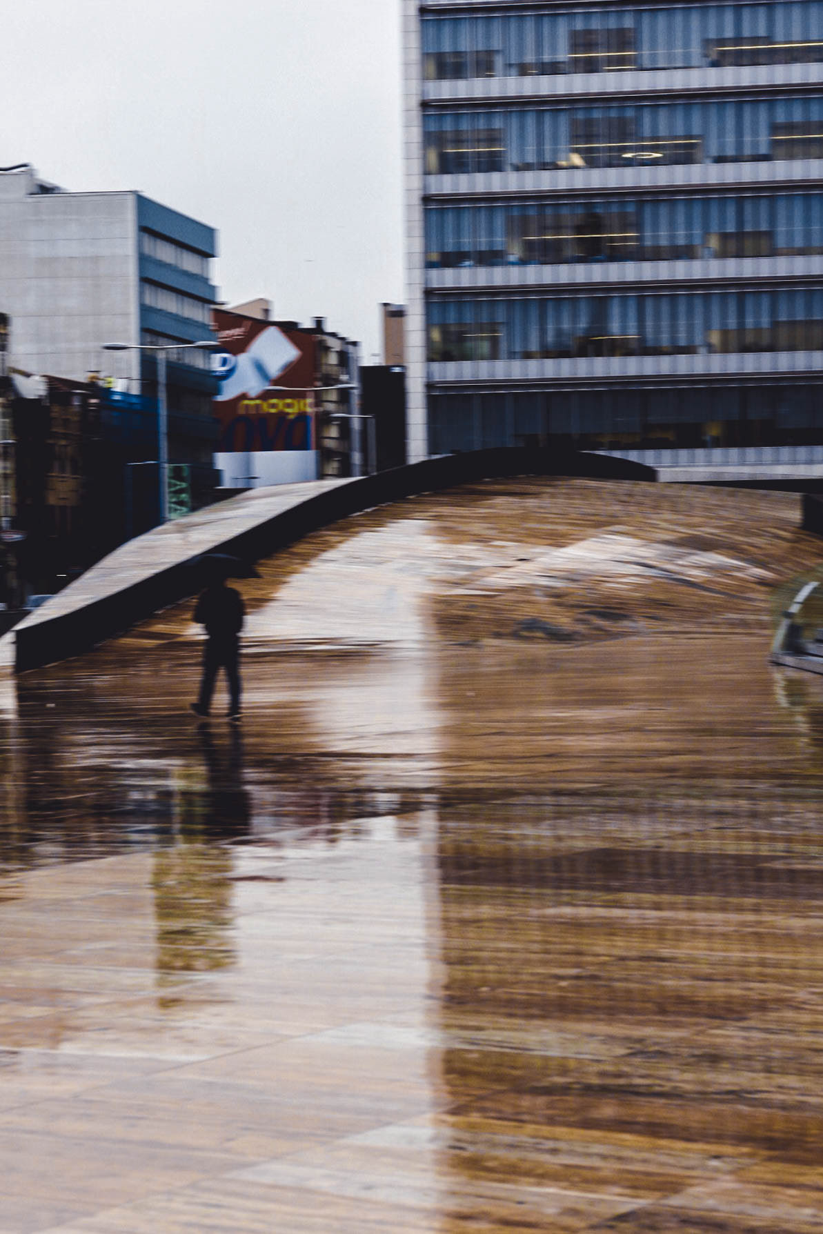
Crash Site.
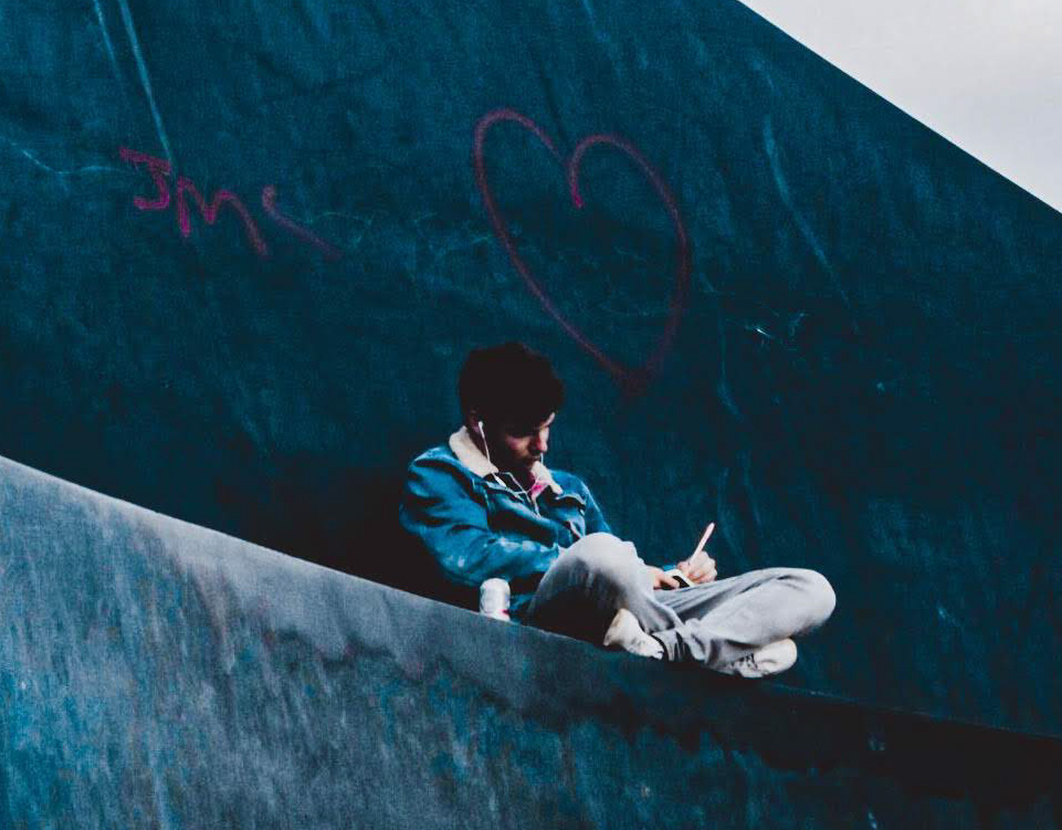
Another of my favourites from the trip, the Casa de Música acted like a meteor crash landing in the traditionalism of Porto create skating space for the Public Realm and unique spaces to explore within it's walls that don't just consider form but culture, acoustics and a vivid use of colour, pattern and texture.
The Bouça development
Álvaro Siza.
Bouça Development.
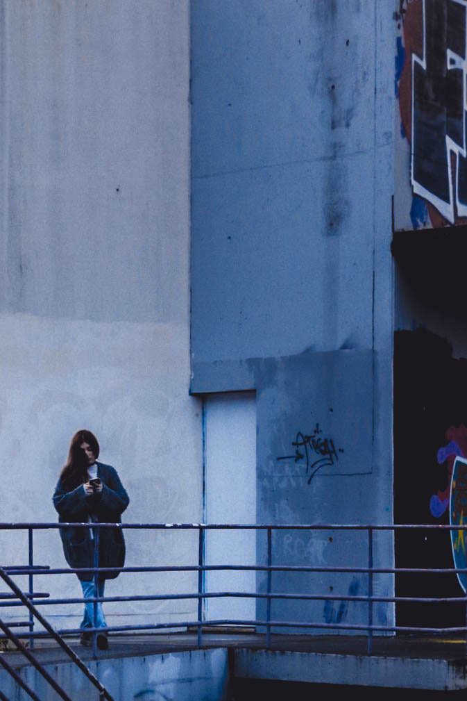
Signs of Time.
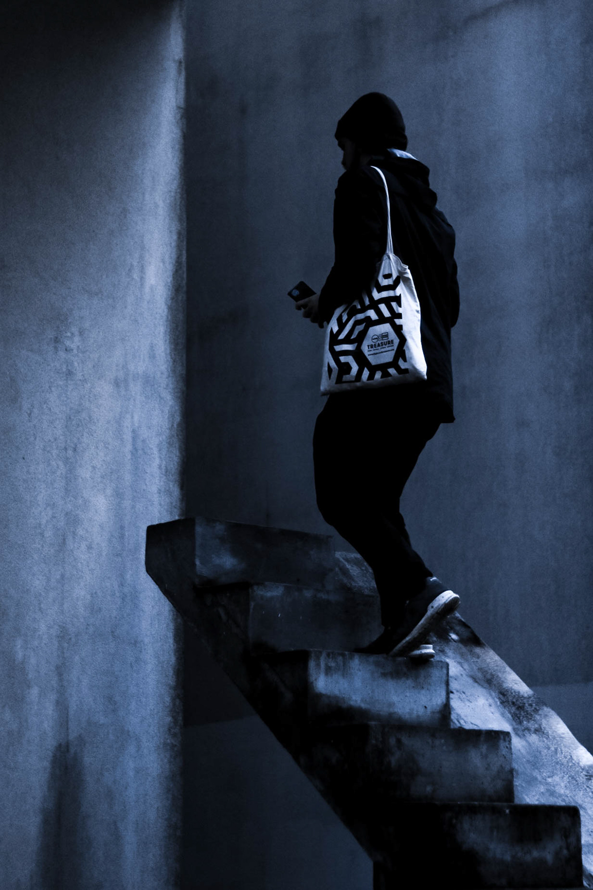
Staircase to Nowhere?
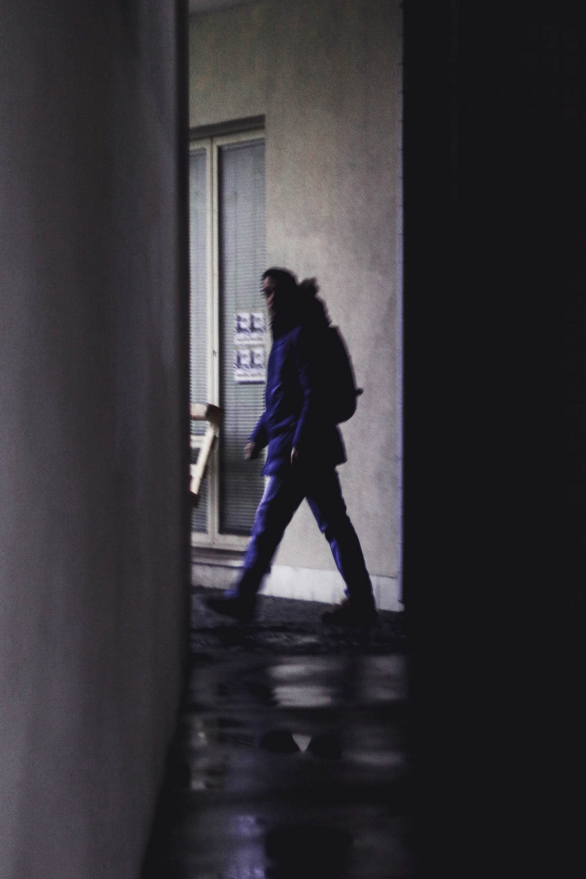
In Transition.
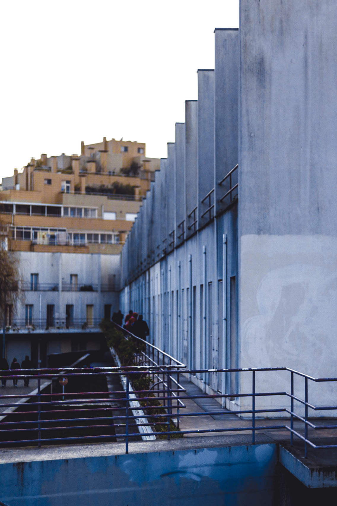
Weathering.
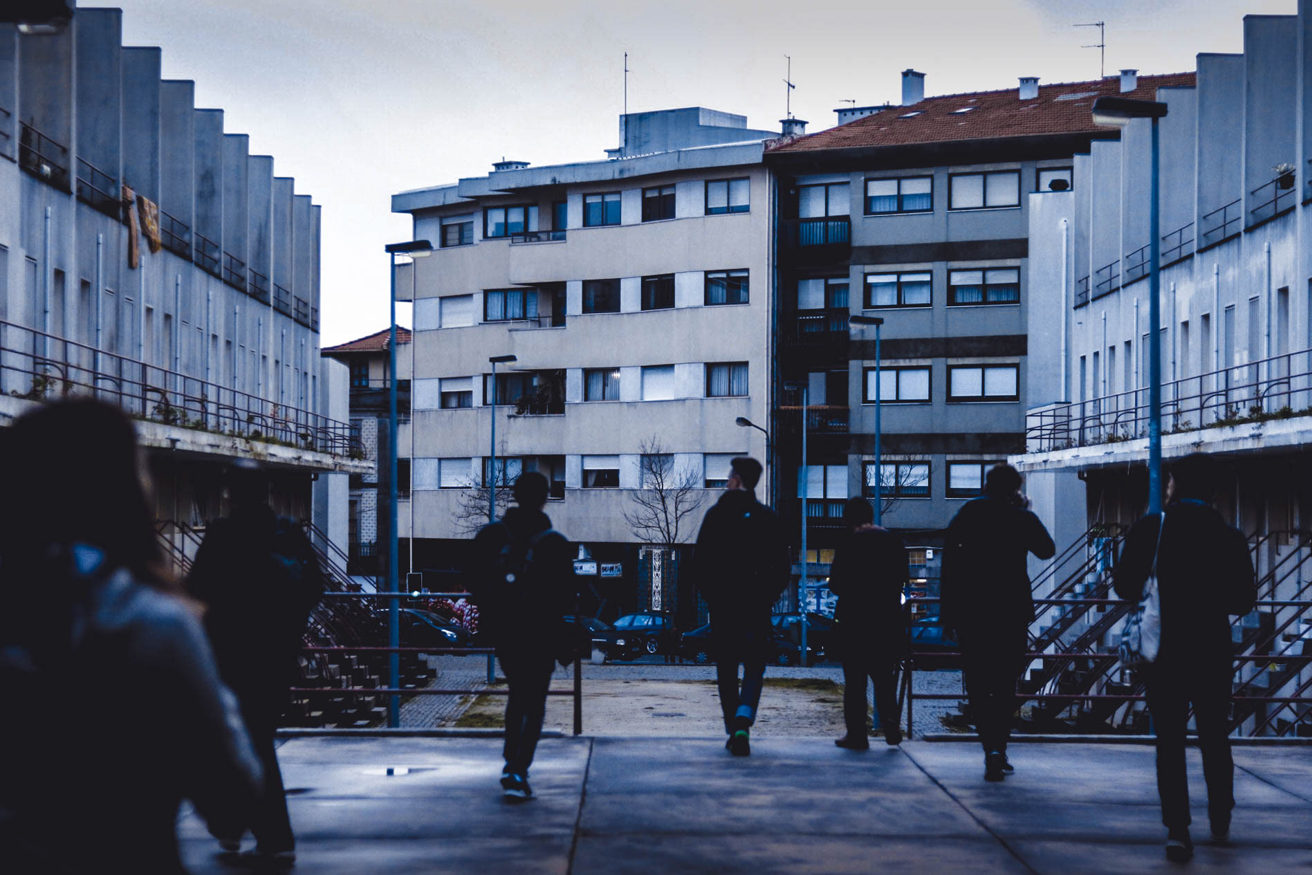
Symmetry.
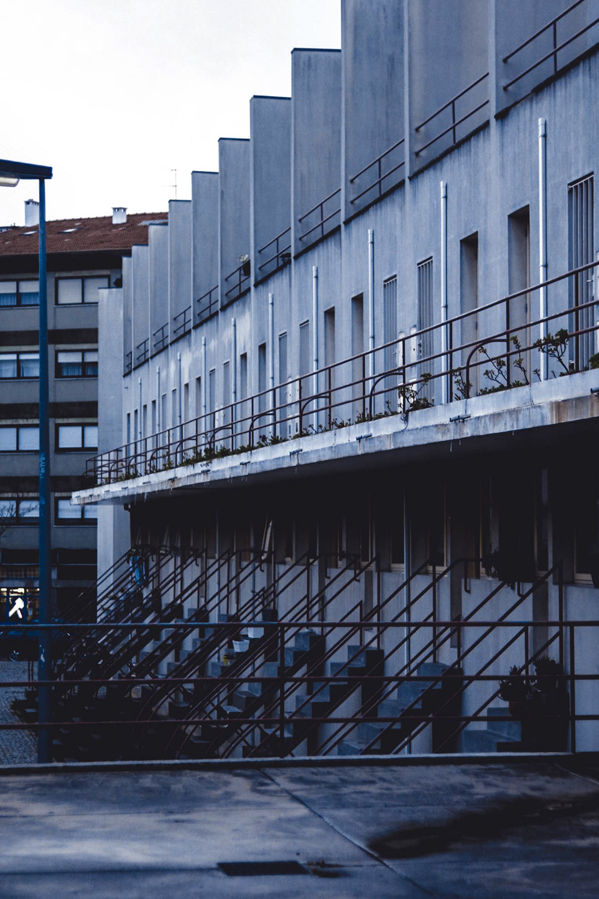
Repetition.
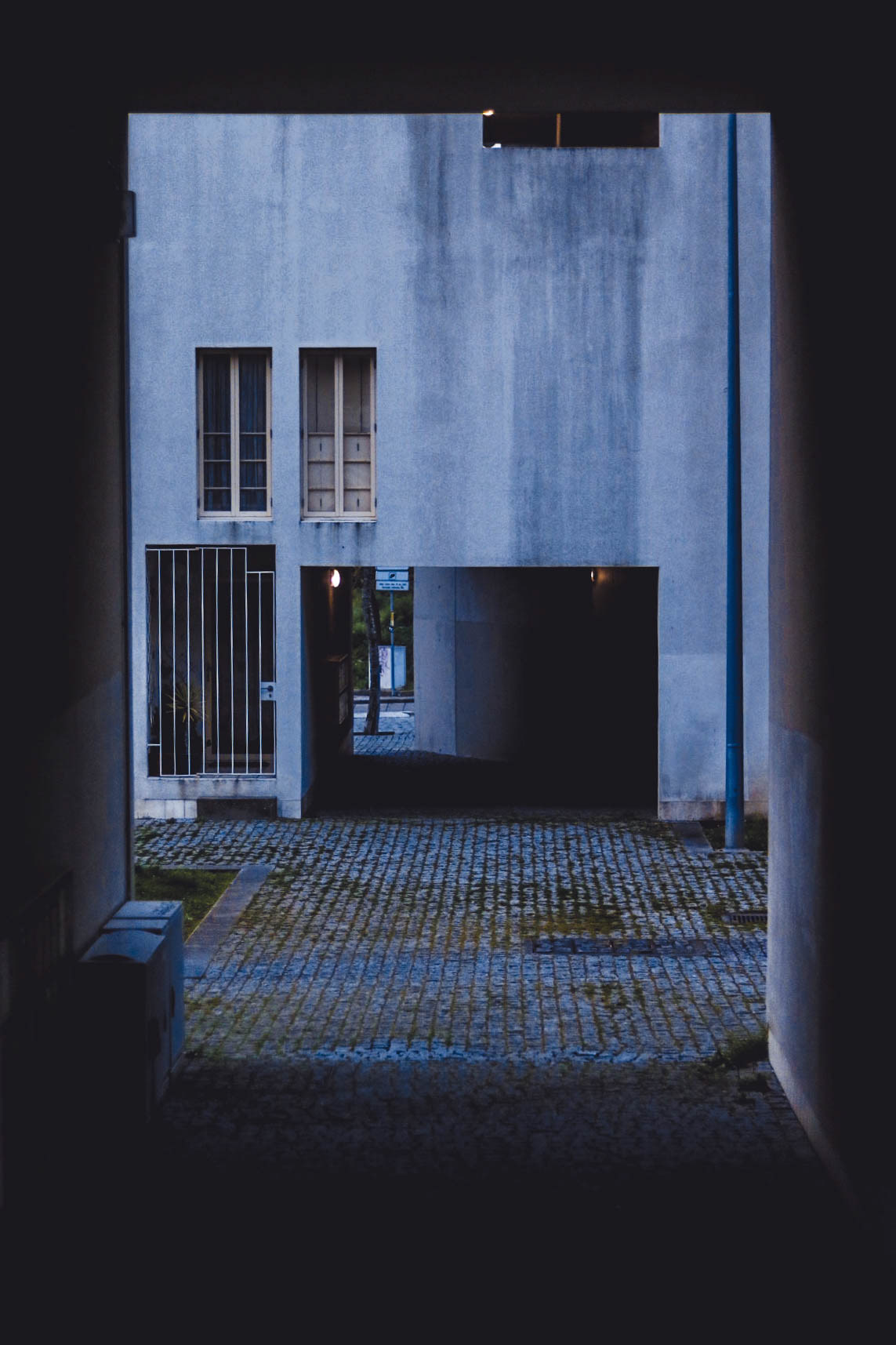
Voids.
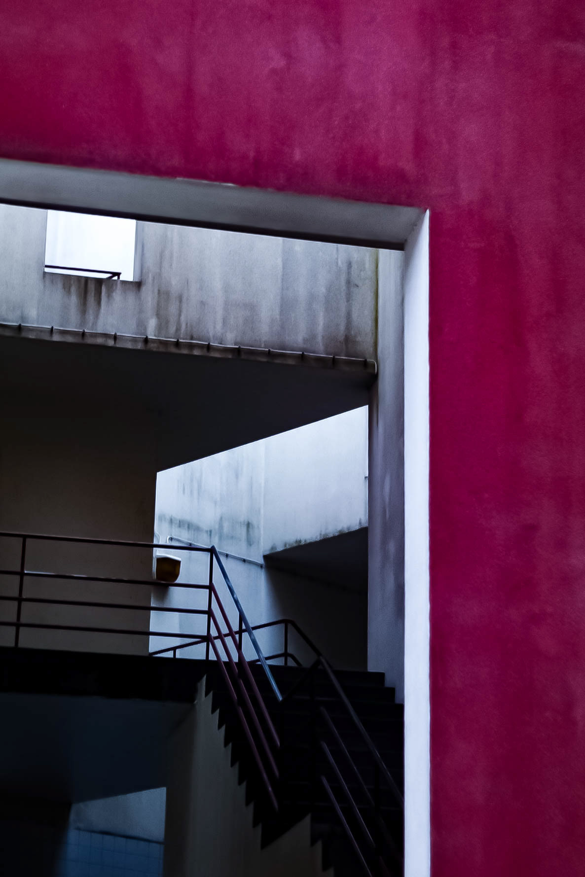
Colour Frame.
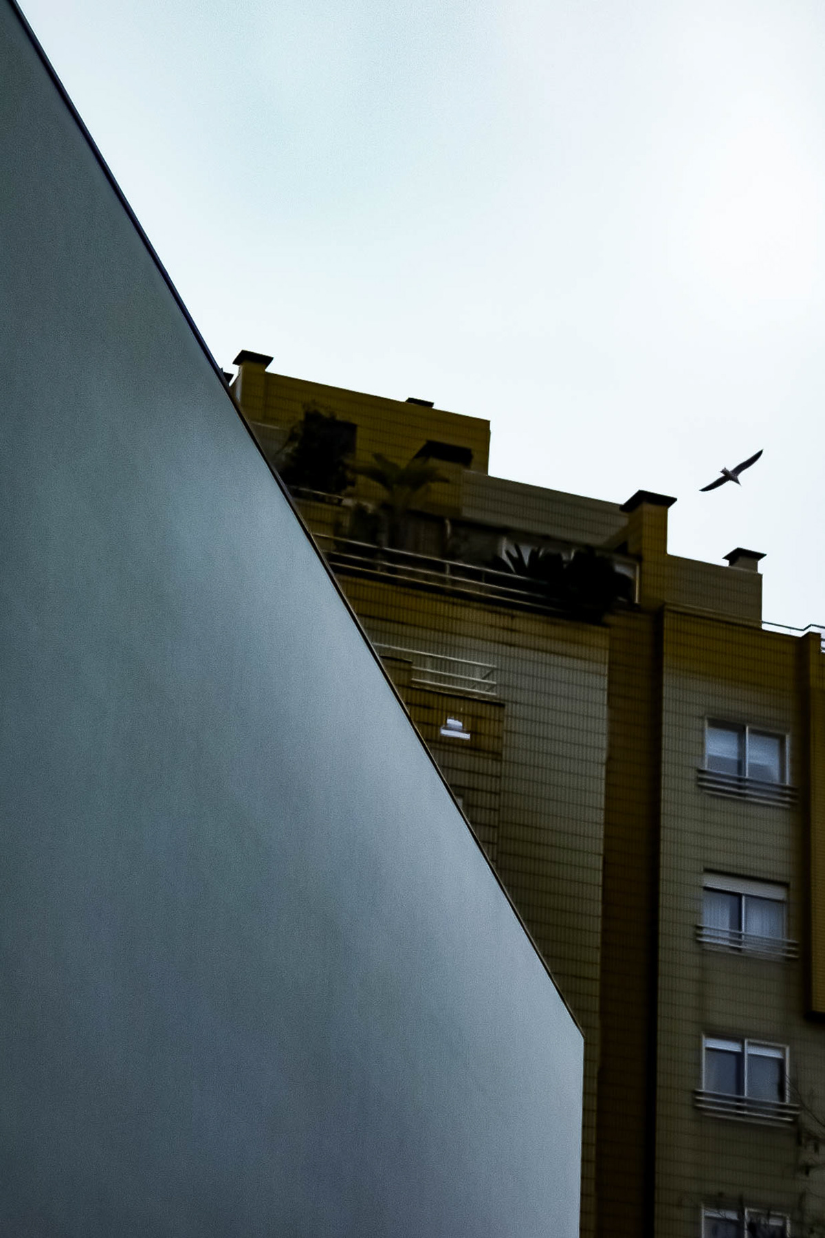
Minimalism in Juxtapose.
We went to the Bouça development late in the day, and it may have been it's age showing or the overcast post rain weather but the scheme seemed somewhat empty, it was unfortunately one my lesser favourite projects to visit on the trip.
Serralves
Álvaro Siza.
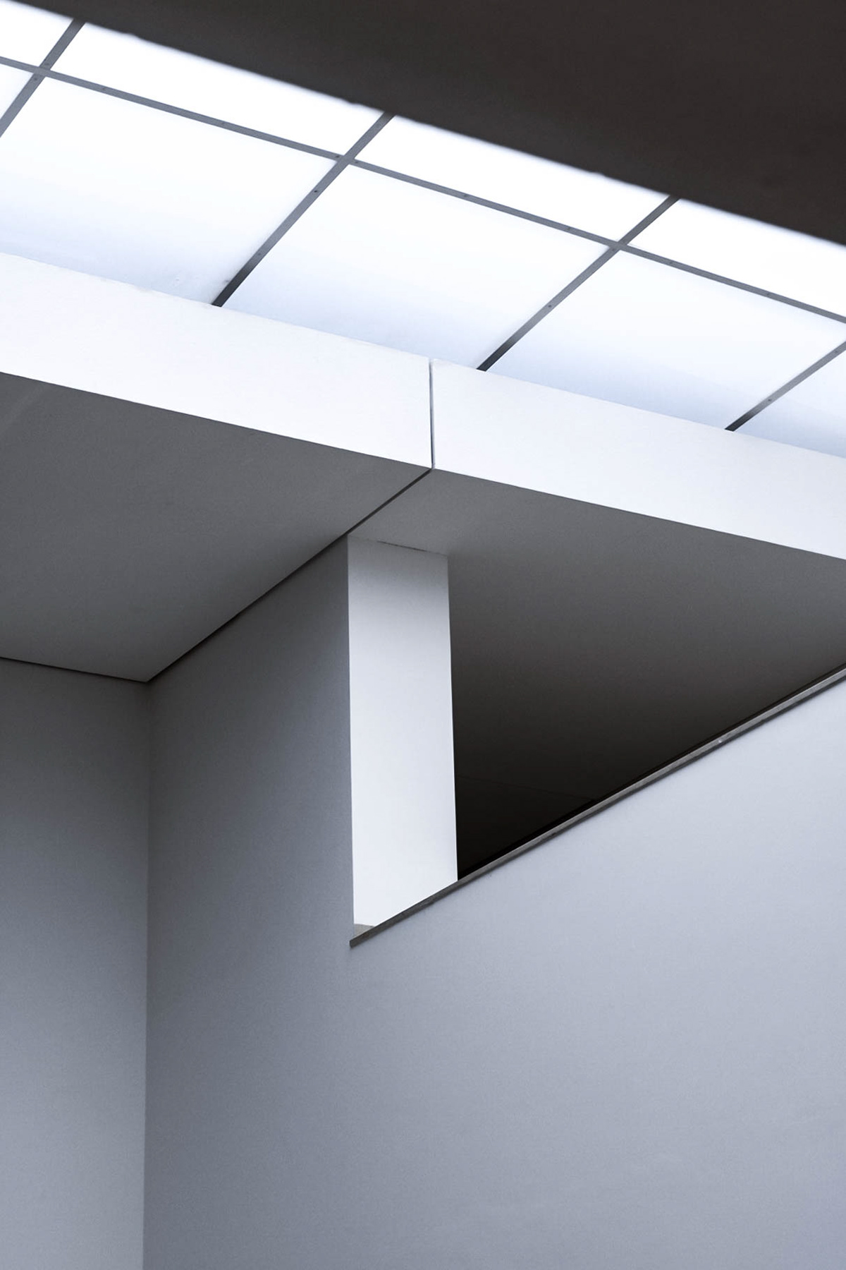
Clean Lines.

Frame I.
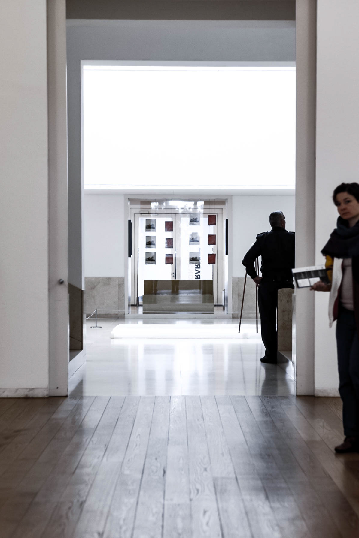
Frame II.
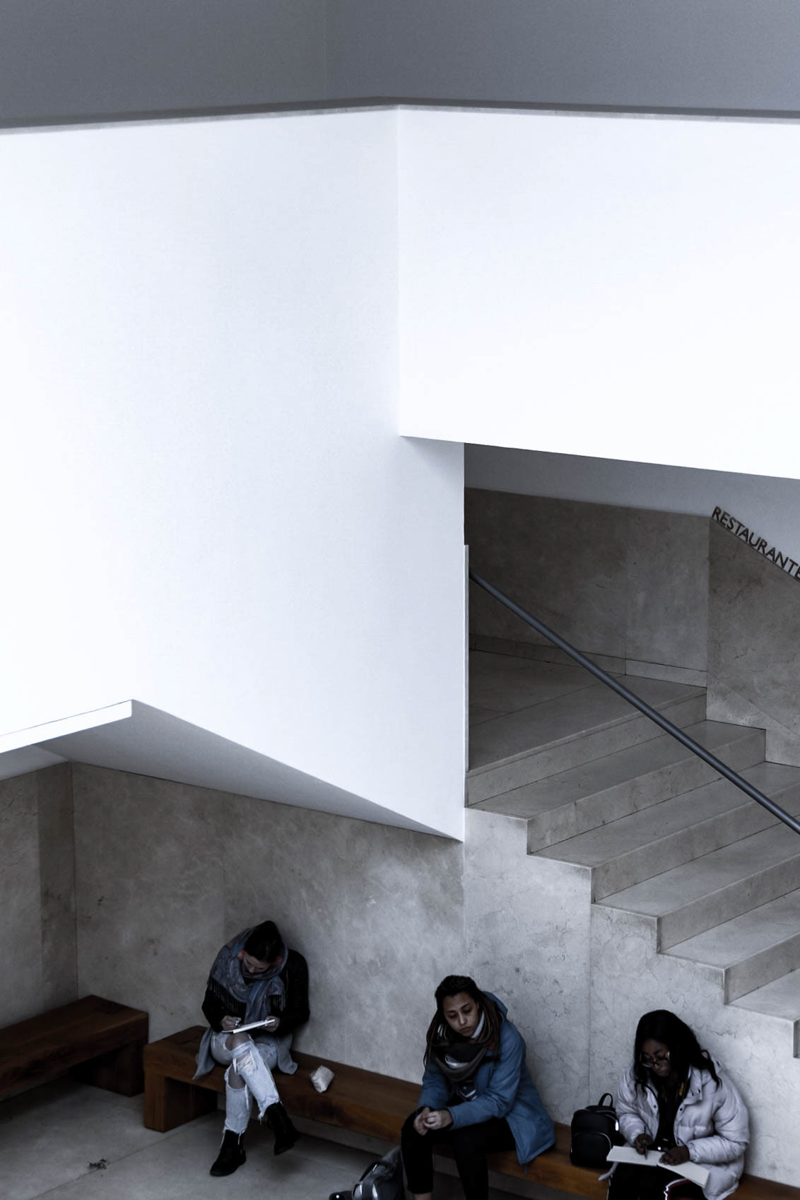
Material, Void, Minimalism.
A quick visit to Serralves Gallery, we explored yet another of Siza's works showcasing his use of clean lines, minimalist forms making clear use of space and void to articulate and frame views through the space.
University of Porto
Álvaro Siza.
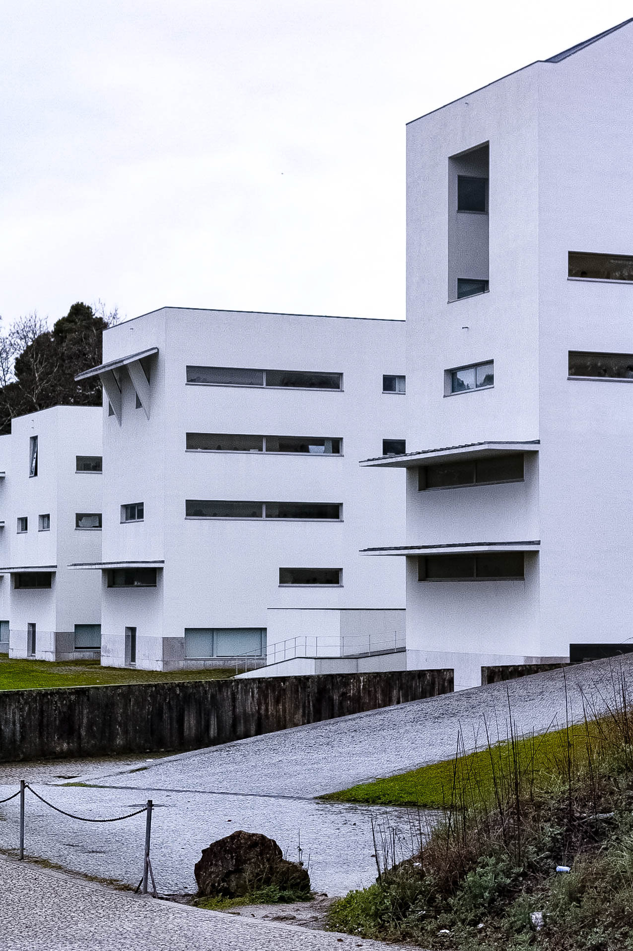
University of Porto.
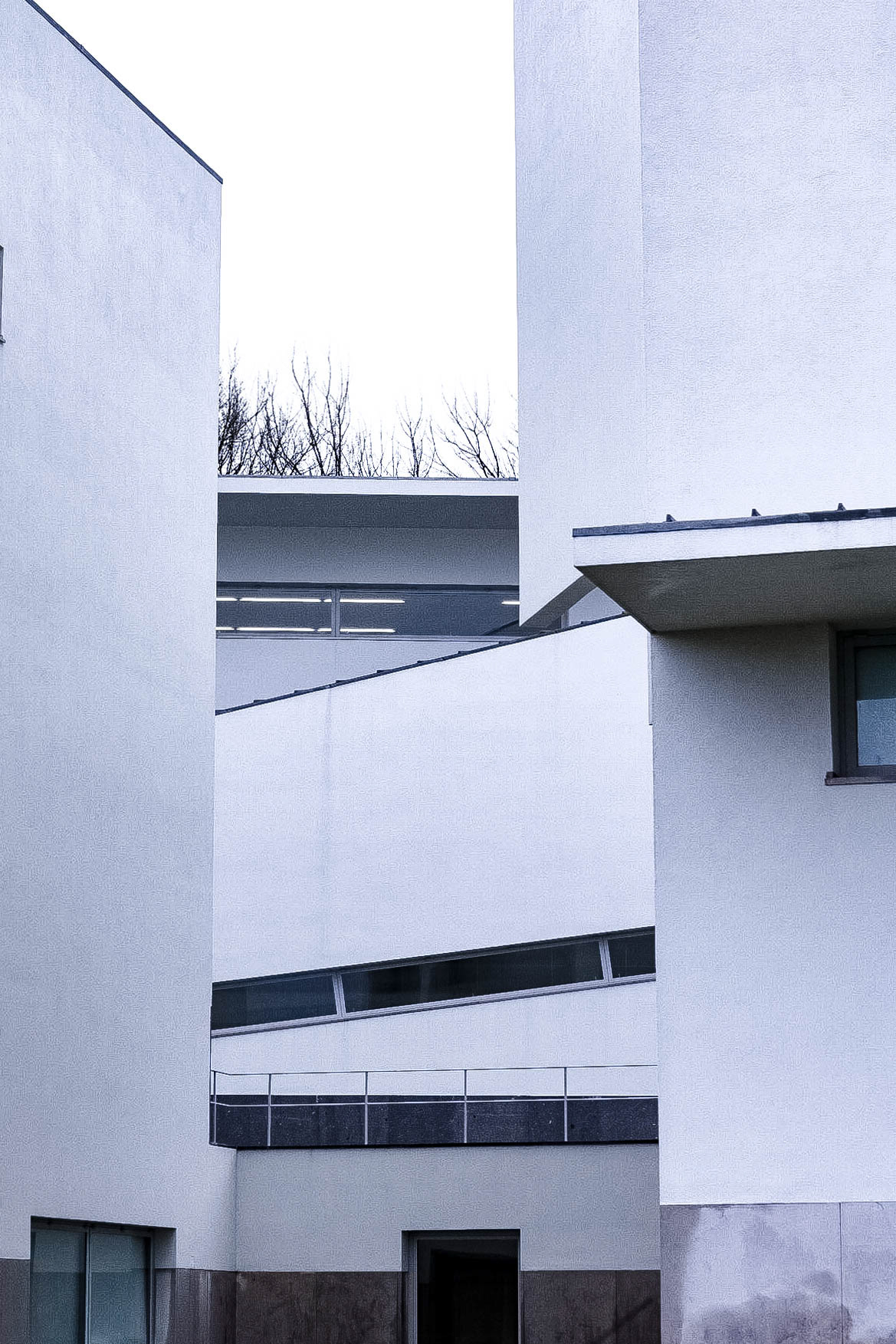
Framing with Form.
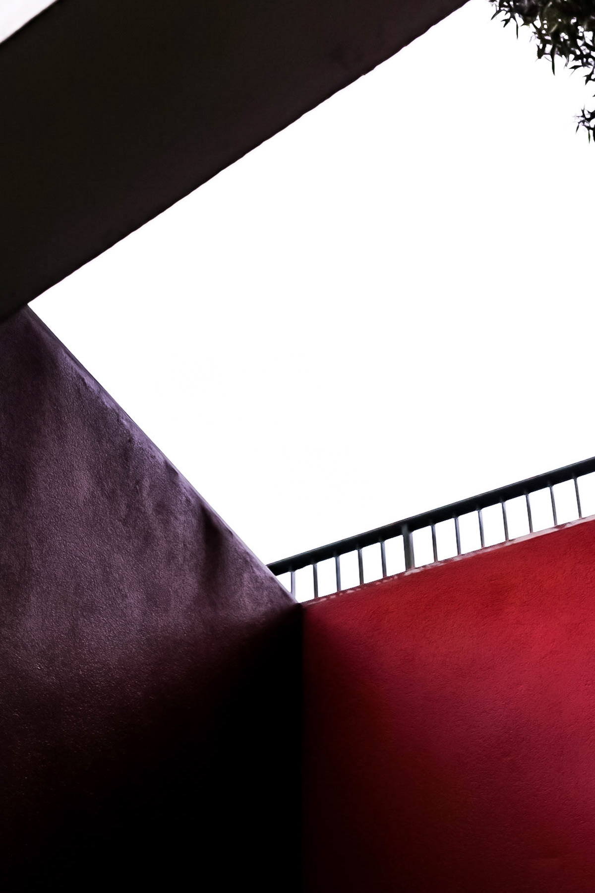
Colour Splash.
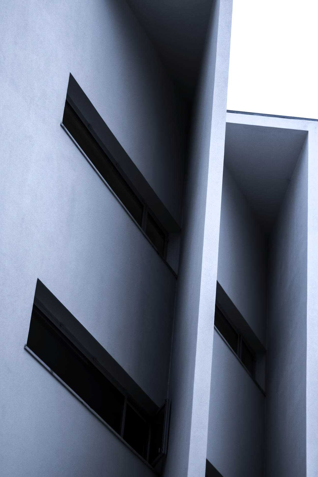
Angular.
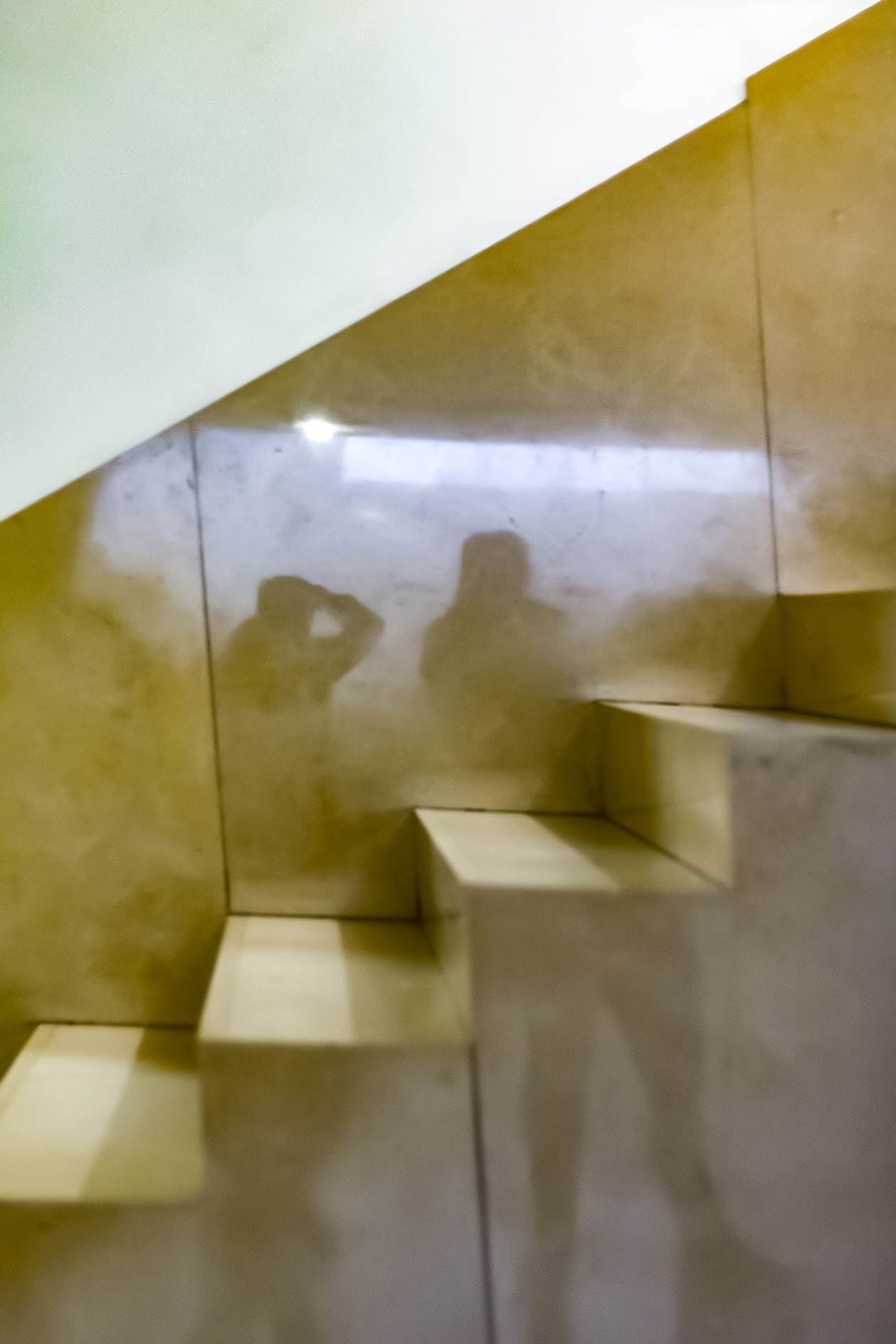
Stair Detail.
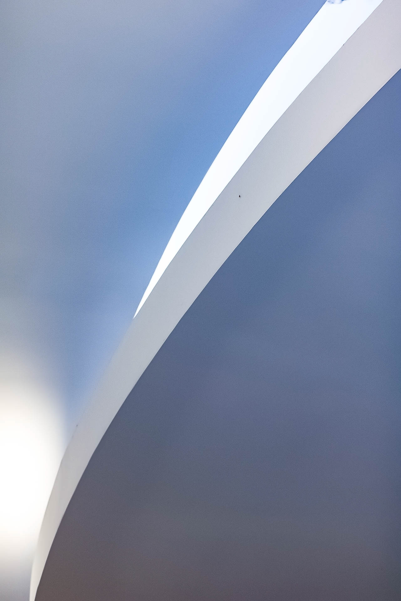
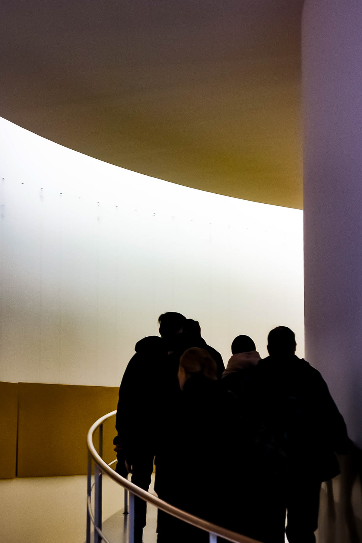
Sweep & Light.
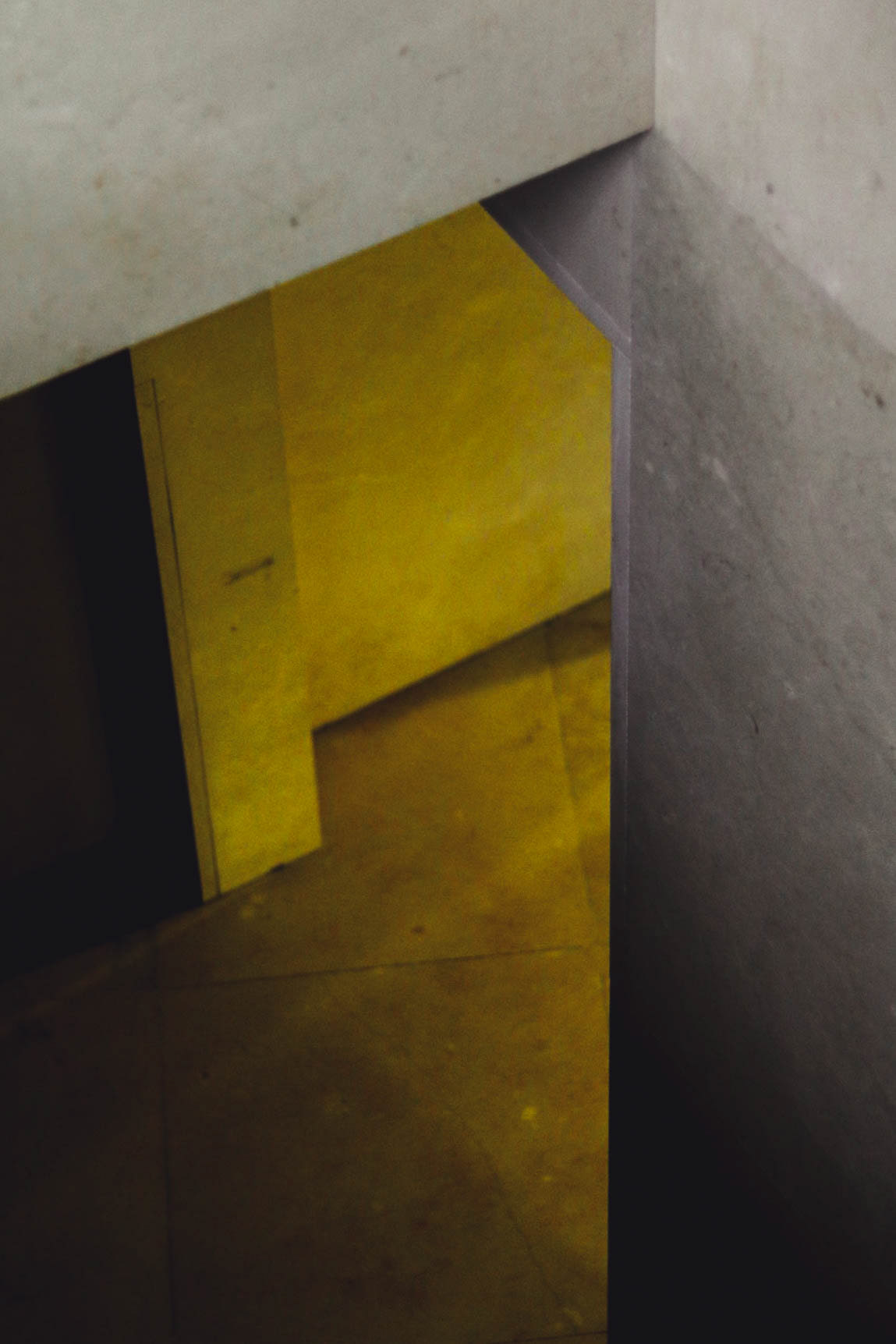
Light & Concrete.
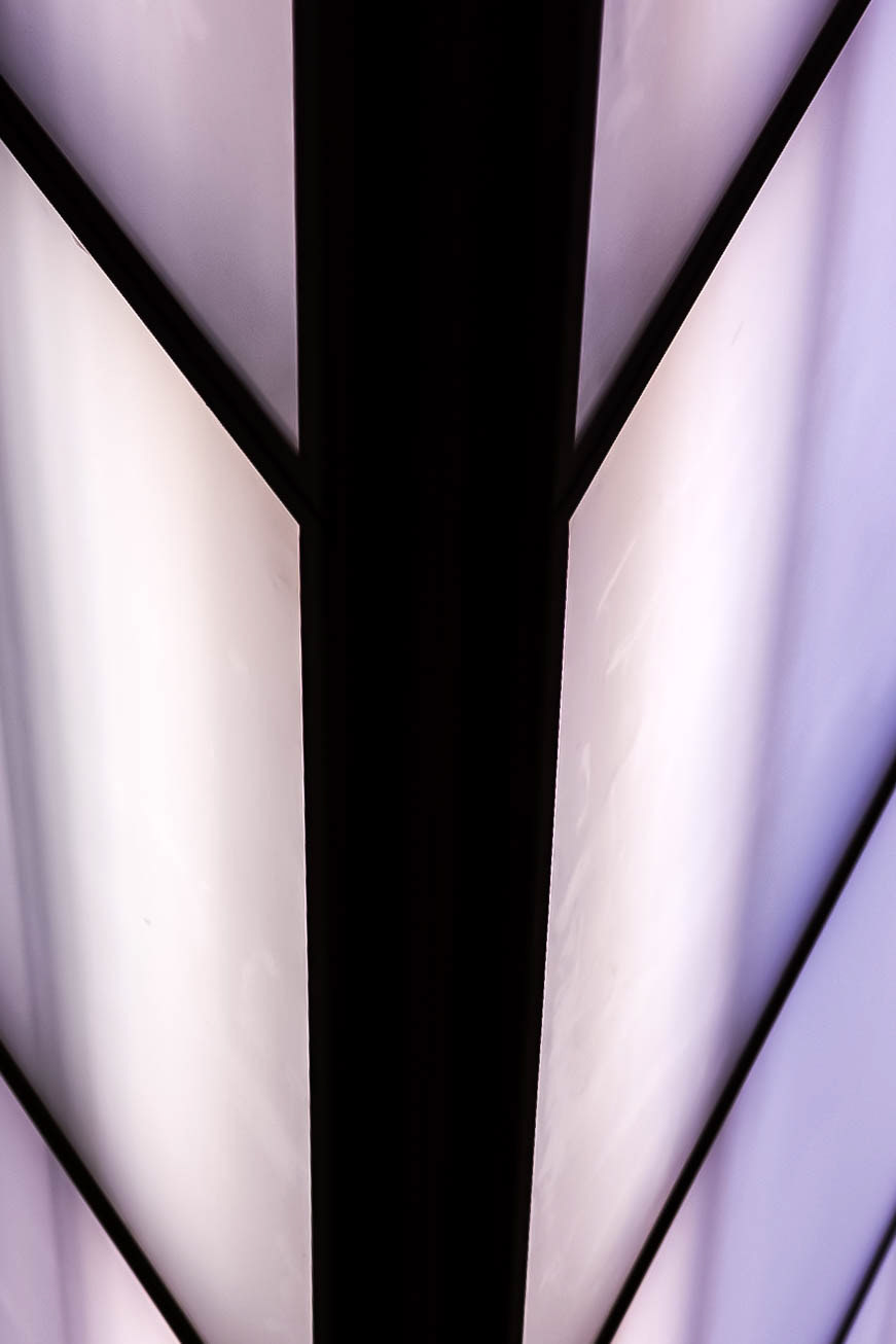
Prism.
University of Porto - Library.
We were also able to get a tour of the University of Porto, yet again another work by Siza, this time much better maintained and the use of material and light in juxtaposition against the minimalist white voids were amazing, Yet, my favourite space may have been the Library, more specifically the prism-like light well that drenched the space with a soft diffused light.
